10 Burgundy and Wine Tone Home Decor Ideas for a Rich, Cozy Home
You’ve lived with beige and gray for years, and while it’s safe, it’s never once made your home feel like it actually has personality. Burgundy and wine tone home decor solves that problem by bringing in a color with real emotional depth, warm, moody, and sophisticated all at once, without tipping into a look that feels dated or overly formal. Major trend forecasters including WGSN, Pantone, and Coloro have all pointed to deep wine tones as anchor colors heading into 2026, and it’s easy to see why once you see how naturally the color pairs with warm wood, brass, and cream. Here are ten ways to bring that rich, grounded warmth into your own home.
1. Know the Difference Between Burgundy and Maroon Before You Shop
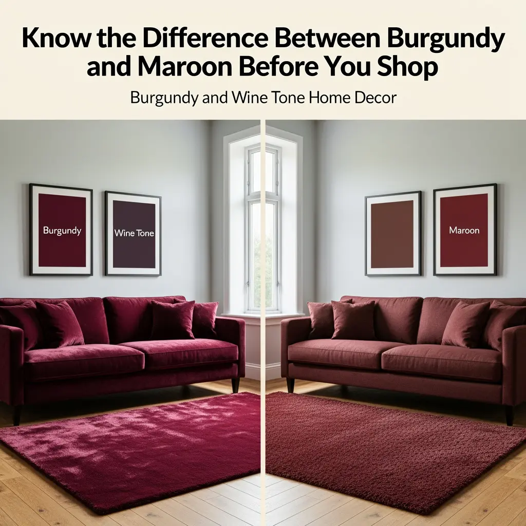
Burgundy and maroon are often used interchangeably, but they’re genuinely different shades, and knowing the difference helps you choose the right one for your space before you commit to paint or furniture.
Telling Them Apart
Burgundy carries purple undertones, closer to the color of fine red wine, and tends to read brighter and more reddish-purple. Maroon, sometimes called Bordeaux, leans toward red and brown instead, giving it an earthier, more muted character. If you’re testing paint or fabric samples, holding them side by side in your actual room lighting makes this difference much easier to spot than comparing them on a screen or in a showroom.
2. Start Small With Textiles Before Committing to Paint
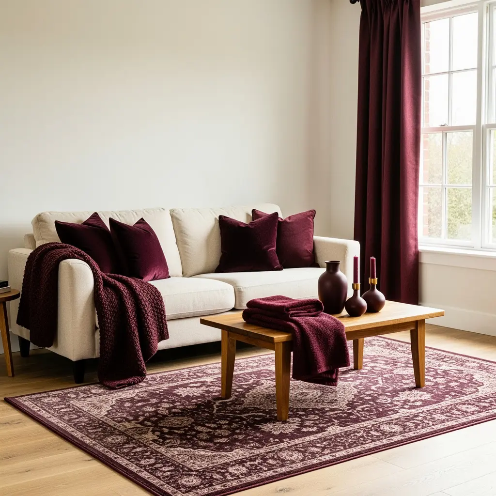
The lowest risk, most forgiving way to bring burgundy and wine tone home decor into a space is through textiles, throw pillows, a blanket, patterned curtains, rather than jumping straight to a wall color.
A couple of burgundy scatter cushions and a throw can instantly warm up a neutral cream or beige sofa, especially in cooler months when lighter colors can start to feel a little cold. This approach also lets you live with the color for a while before deciding whether you want to commit to something more permanent, like a painted wall or reupholstered furniture.
3. Try a Color-Drenched Powder Room for Maximum Drama
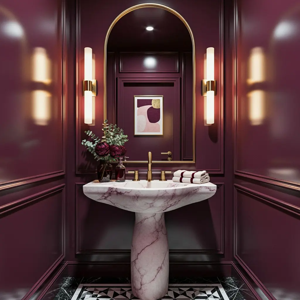
Where a living room or bedroom generally calls for some restraint, a powder room is where designers consistently suggest going bold with burgundy and wine tone home decor, since a small, enclosed space can handle drama that a larger room can’t.
The Cocooning Effect
Drenching the walls, trim, and even cabinetry in a single deep burgundy shade creates what designers call a cocoon-like effect, an intimate, unapologetically moody room that feels intentional rather than overwhelming precisely because it’s contained to one small space. This is a genuinely good entry point if you’re drawn to the color but hesitant to commit a larger, more frequently used room to it.
4. Pair Burgundy With Warm Wood Tones
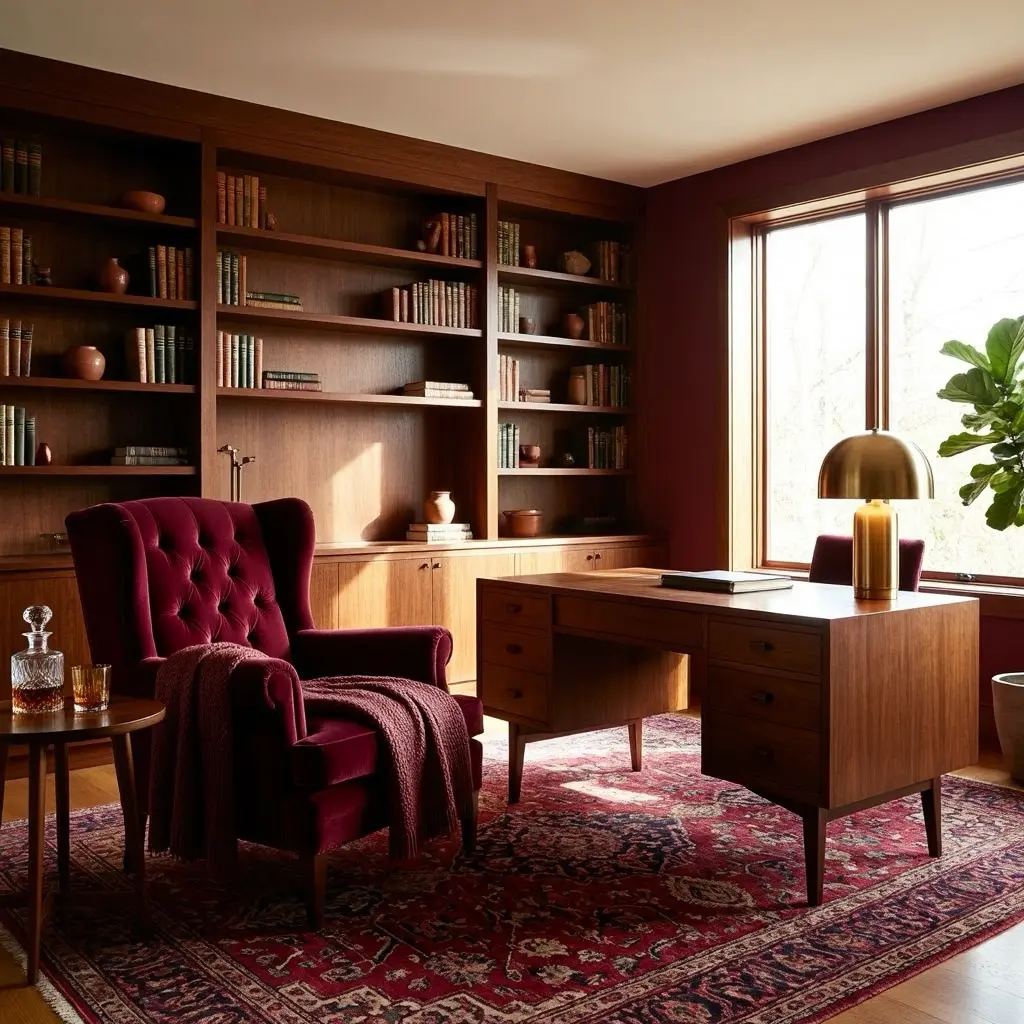
Burgundy and wine tone home decor pairs naturally with warm wood, since both carry a similar richness that keeps the combination feeling grounded and cohesive rather than clashing.
Oak, walnut, and other warm toned woods on furniture, flooring, or trim work particularly well against burgundy walls or upholstery. This pairing also has practical staying power, since wood tones are relatively neutral and easy to build around even if your specific shade of burgundy or the pieces around it change over time.
5. Use Brass or Gold Hardware to Add Elegance
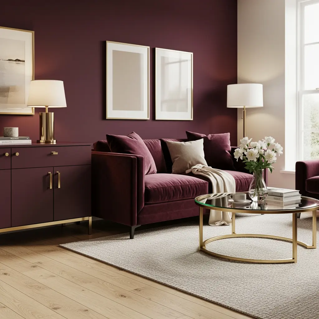
Burgundy has a natural affinity for warm metal finishes, and brass or gold hardware, on cabinetry, light fixtures, or furniture legs, adds a layer of elegance that makes the color feel thoughtfully designed rather than simply painted on.
Where This Pairing Works Best
A burgundy accent wall with brass picture frame hardware, or burgundy upholstered furniture with brass legs, both let the metal catch the light against the deep, matte richness of the wine tone. This combination is a common thread across current burgundy interior coverage precisely because it reads as sophisticated without requiring a full room renovation.
6. Mix Textures When Using Burgundy as a Single Tone
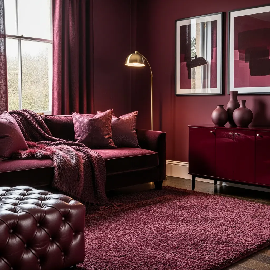
When burgundy is the dominant color in a room, varying the texture across different surfaces keeps the space from feeling flat, since a single uniform tone applied to every material can start to look one dimensional.
Velvet upholstery, a matte painted wall, glossy ceramic accents, and a woven wool rug can all carry the same burgundy tone while still reading as layered and considered. This texture-first approach is especially useful in a fully color-drenched room, where the color itself isn’t providing visual variety, so the materials need to do that work instead.
7. Try the Chartreuse and Burgundy Pairing for a Bold Statement
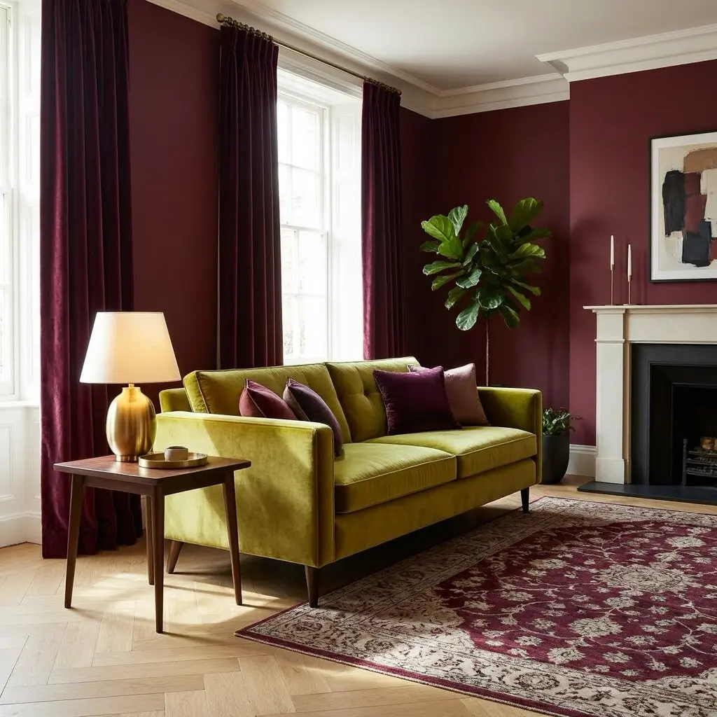
One of the more unexpected color combinations trending for 2026 pairs burgundy with chartreuse, an energetic, acidic green, creating a striking, jewel-toned contrast that reads as elevated rather than clashing when balanced correctly.
How to Make This Pairing Work
Rather than using both colors in equal amounts, most current design guidance suggests choosing one as the dominant shade and using the other as an accent. A room color-drenched in deep burgundy with chartreuse introduced through pillows, art, or a patterned rug tends to feel more intentional than an even split between the two. Tying the pairing together with a patterned element, a throw pillow or rug that includes both colors alongside a neutral, helps the combination read as a deliberate design choice rather than two unrelated colors placed side by side.
8. Use Burgundy as a Bedroom Anchor Color
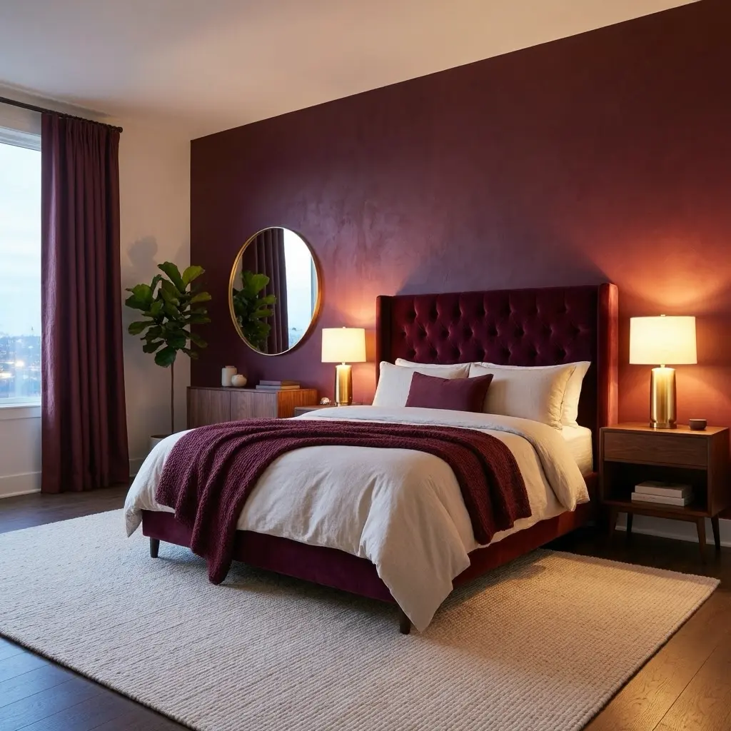
A bedroom is a natural place for burgundy and wine tone home decor, since the color’s warmth and moodiness suit a room meant for rest and comfort rather than bright energy.
Pairing a deep burgundy or wine toned accent, whether through bedding, a headboard, or an accent wall, with a cream or ivory base keeps the room feeling cozy rather than heavy. A color-drenched dark, moody wall paired with a simple cream duvet and burgundy accent textiles layered on top is a combination that shows up frequently in current 2026 bedroom coverage for exactly this reason.
9. Add Burgundy Through a Statement Furniture Piece
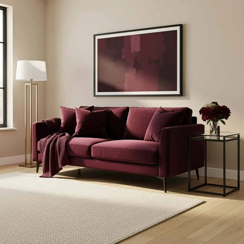
If painting a room in burgundy feels like too large a commitment, a single statement furniture piece, a velvet sofa, an accent chair, or a cabinet, lets the color anchor a room without covering every wall.
This approach also makes the color considerably easier to change later, since swapping a piece of furniture is far less involved than repainting or reupholstering a whole room. A burgundy velvet accent chair against otherwise neutral walls and furniture creates a clear focal point that still allows the rest of the room to stay flexible.
10. Treat Burgundy as a Grounding Neutral, Not Just a Trend Color
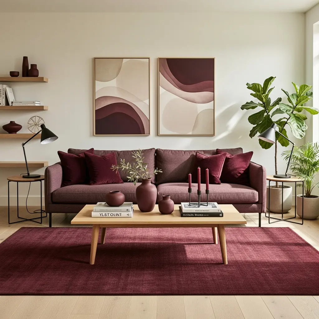
Despite its recent surge in popularity, most current design coverage treats burgundy and maroon as genuinely timeless choices rather than fleeting trend colors, since the tone’s depth and warmth have held appeal across multiple design eras.
This matters practically too. Rather than treating a burgundy update as something you’ll need to undo once the trend cycle moves on, it’s worth choosing pieces and paint colors you’d still want to live with in five or ten years. Using burgundy as a grounding, foundational color rather than a purely decorative trend accent tends to result in a room that ages well rather than looking dated once the next color trend arrives.
Mistakes to Avoid
- Confusing burgundy and maroon. They carry different undertones, purple versus brown, so compare actual samples before choosing between them.
- Committing to a full room repaint before testing the color. Starting with textiles lets you live with burgundy before making a more permanent decision.
- Pairing burgundy with cool metal finishes. Brass and gold generally complement the color’s warmth better than chrome or silver.
- Using a single flat texture throughout a color-drenched room. Varying texture, velvet, matte paint, ceramic, wool, keeps a heavily burgundy room from feeling flat.
- Splitting the chartreuse and burgundy pairing evenly. Choosing one as dominant and the other as an accent reads as more intentional than an even split.
- Treating burgundy as a short lived trend. Current design coverage points to it as a timeless, grounding color rather than something that will feel dated quickly.
Frequently Asked Questions
What’s the difference between burgundy and maroon in home decor? Burgundy has purple undertones and reads brighter and more reddish-purple, similar to red wine. Maroon leans toward red and brown, giving it an earthier, more muted quality. Comparing physical samples in your actual room lighting is the best way to tell them apart.
Is burgundy home decor a passing trend? Most current coverage treats burgundy as a lasting, grounding color rather than a short lived trend, pointing to its emotional depth and versatility as reasons it has held appeal across multiple design eras, not just a single trend cycle.
What colors pair well with burgundy in home decor? Warm wood tones, cream and ivory neutrals, and brass or gold accents are the most consistent and reliable pairings. Chartreuse green is a bolder, more unexpected pairing gaining attention for 2026, best used with one color dominant and the other as an accent.
Where should I start if I want to try burgundy in my home? Textiles are the lowest risk starting point, a couple of throw pillows or a blanket on a neutral sofa. A powder room is a good next step if you want to try a fully color-drenched space without committing a larger, more frequently used room.
Does burgundy work in a small room? Yes, and it can actually work especially well in a small space like a powder room, where the enclosed size supports the intimate, cocoon-like effect that a fully color-drenched burgundy room creates.
Bringing It All Together
Burgundy and wine tone home decor doesn’t require repainting your entire home to make a real difference. Starting with textiles, a few pillows or a throw, and adding one statement piece, a velvet chair or a color-drenched powder room, usually gets a home most of the way there. From there, warm wood, brass accents, and varied texture are what turn a single bold color choice into a space that feels genuinely rich, cozy, and built to last well beyond this year’s trend cycle.