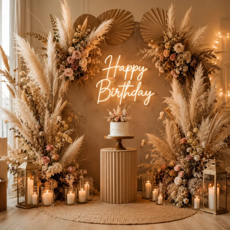
10 Dreamy Pastel Birthday Room Decor Ideas for a Magical Celebration
You want the birthday room to feel special this year, not just a few mismatched balloons taped to a wall and a banner that’s been reused three birthdays in a row. Pastel birthday room decor solves that problem by leaning into a soft, cohesive color palette instead of bright, clashing party colors, and the result feels dreamy and put together rather than last minute. It works just as well for a first birthday as it does for a milestone adult celebration, since soft pinks, lavenders, and mints read as elegant at any age. Here are ten ways to build that look without overspending or overcomplicating the setup.
1. Pick a Two or Three Color Pastel Palette
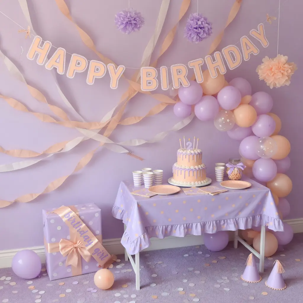
The biggest mistake in pastel decor is trying to use every soft color at once. Pink, lavender, mint, peach, and baby blue all look lovely individually, but combined without a plan they can start to look like a candy store rather than a curated room.
Keep It Simple
Choose two main pastel tones and one metallic accent, gold, rose gold, or silver, and build everything else around that combination. A blush pink and sage green pairing feels soft and modern. Lavender and cream feels more classic and airy. Picking a lane before you shop saves money too, since you won’t end up with leftover decor in colors that don’t match the rest.
2. Build a Balloon Garland Instead of a Single Balloon Bunch
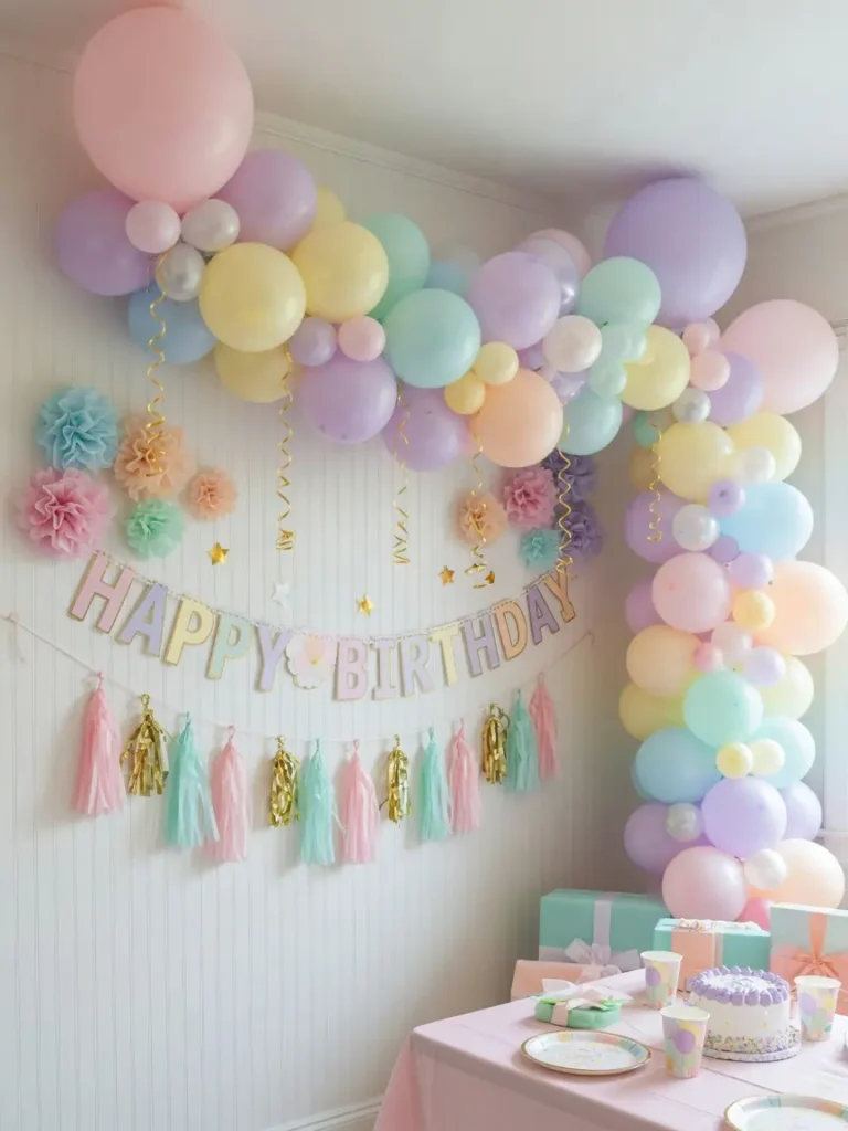
A scattered handful of balloons tied to a chair can look thin and a little sad in photos. A balloon garland, where balloons of different sizes are clustered along an arch or draped across a wall, fills the same space with far more visual impact.
Mixing balloon finishes, matte, pastel, and a few chrome or confetti balloons in your accent metallic, adds dimension so the garland doesn’t read as flat. Most balloon garland kits with a strip and glue dots run in a moderate price range and can be assembled at home in under an hour with a hand pump.
3. Use Warm, Soft Lighting Instead of Harsh Overhead Light
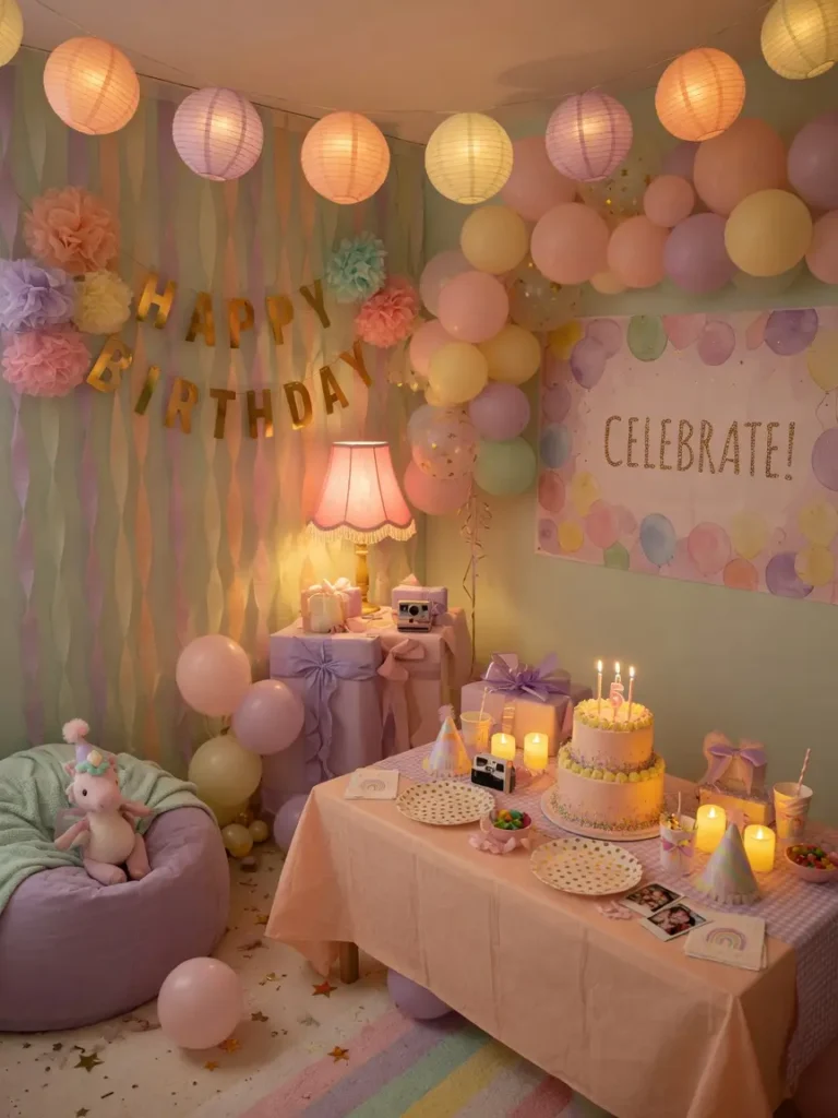
Overhead lighting can wash out a carefully chosen pastel palette, making soft pinks look pale and washed rather than warm and inviting.
Why Warm Light Matters Here
Pastel colors are already low contrast, so they need warmer, dimmer lighting to read as cozy rather than flat. String lights in warm white, rather than cool white, keep the room feeling soft. If the space has a dimmer switch, use it. If not, a few strategically placed lamps or a string light setup can do the same job for a relatively small cost.
4. Layer Textures Within the Same Color Family
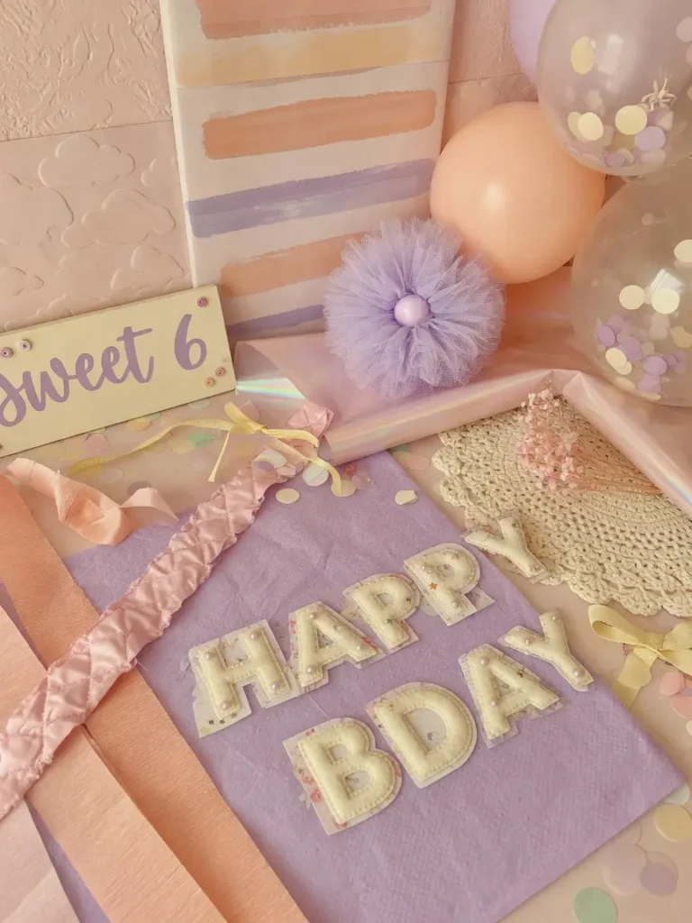
A room that’s entirely smooth balloons and flat paper decor can look a little one dimensional, even with a beautiful color palette. Adding texture, tulle, fringe garlands, ruffled paper fans, or a soft knit throw on a nearby chair, gives the eye more to take in.
Mixing matte paper decorations with a few glossy or metallic pieces creates the same kind of depth that texture adds in home decor more broadly. This matters more in pastel setups than bold color ones, since without strong color contrast, texture is doing a lot of the visual work.
5. Choose a Cake That Matches Without Overwhelming the Palette
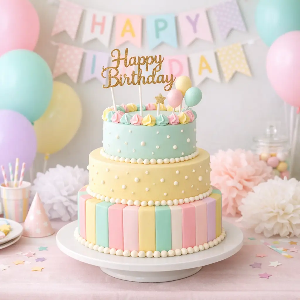
An overly bright or heavily decorated cake can clash with a soft pastel room instead of complementing it. A cake in cream, blush, or soft sage with delicate piping or a few fresh flowers usually photographs better against a pastel backdrop than one with bold, saturated frosting.
If you’re ordering from a local bakery, bringing a photo reference in your exact chosen pastel tones helps avoid a mismatch between the cake and the rest of the room.
6. Add a Focal Point Backdrop for Photos
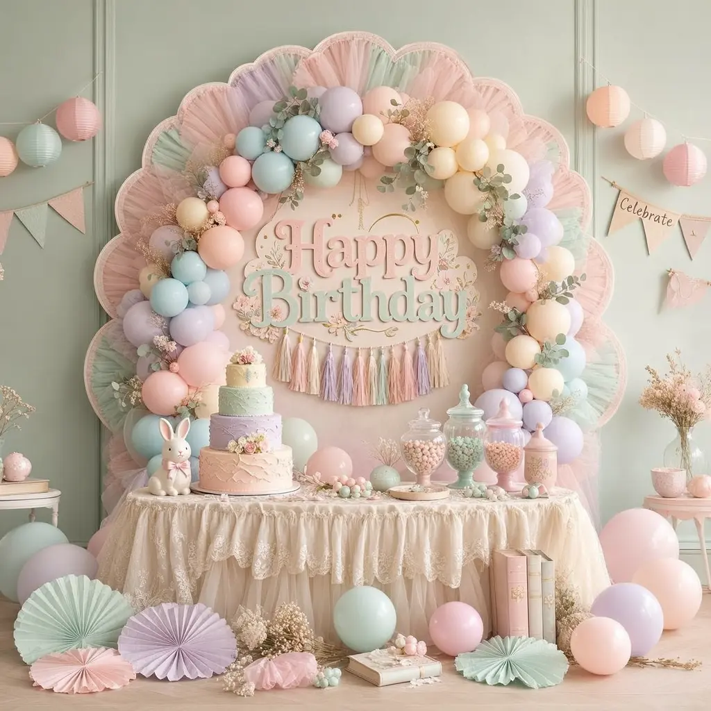
A dedicated photo backdrop gives the room a clear gathering point and makes the whole setup feel more intentional. It doesn’t need to be elaborate.
Simple Backdrop Options
A pastel fabric or paper fan backdrop with a few strands of warm string lights woven through creates depth without much effort. A cluster of oversized balloons anchored to one wall works just as well. Picking one wall and committing to it usually looks more polished than spreading smaller decor thin across the whole room.
7. Use Fresh or Faux Florals in Soft, Muted Tones
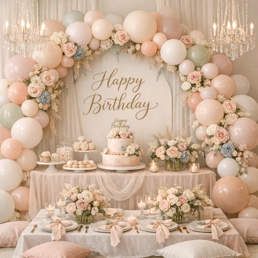
Bright, saturated florals can pull focus away from a soft pastel palette. Muted florals, dusty pink roses, ranunculus, or soft eucalyptus greenery, blend into the room instead of competing with it.
If fresh flowers aren’t practical for the event, quality faux stems in the same muted tones hold up well in photos and can be reused for future celebrations, which makes them a reasonable investment if birthdays happen every year in the same space.
8. Keep Table Settings Coordinated but Not Matchy
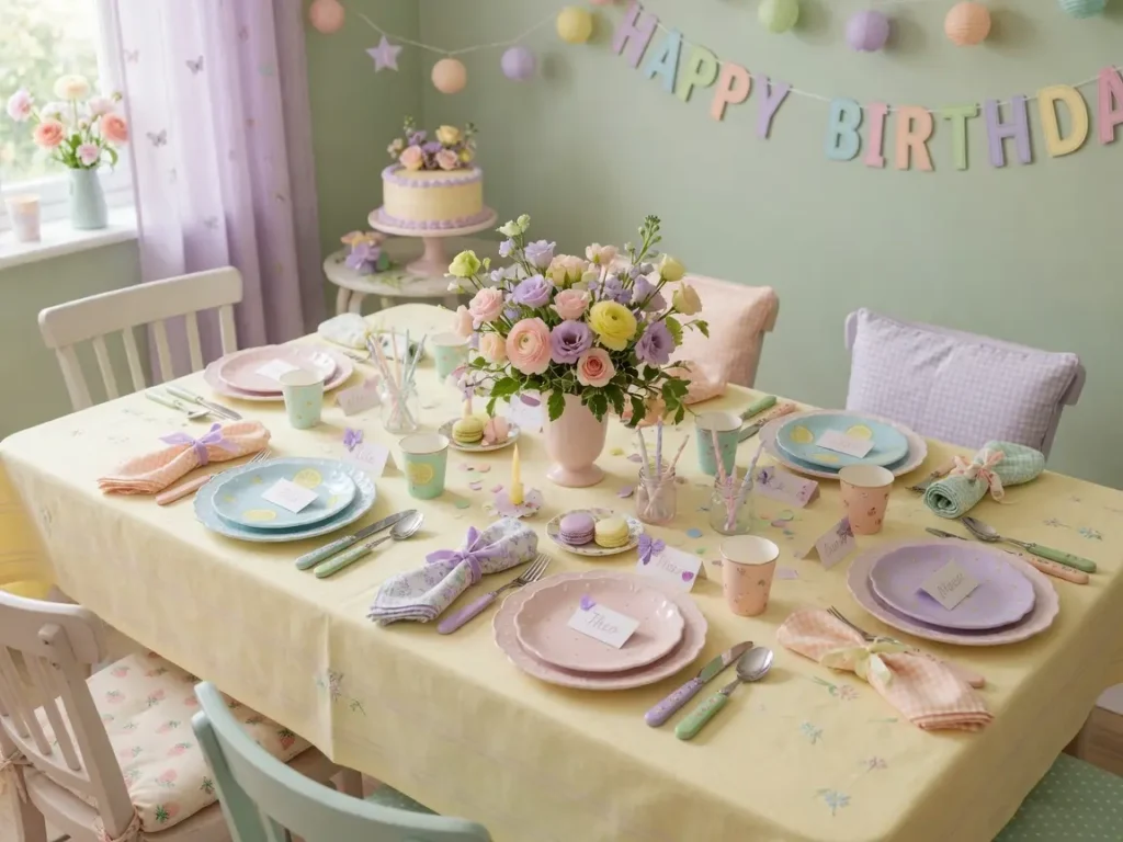
A table where every single item is the exact same shade of pink can start to look flat rather than curated. Mixing two pastel tones with one neutral, like cream or white plates with a blush napkin and a sage green ribbon, keeps the table feeling layered instead of monochrome.
A Small Detail That Photographs Well
Tying napkins with a thin ribbon in your accent metallic, rather than folding them flat, adds a small styling touch that signals effort without adding much cost.
9. Add Personalized Signage or a Small Name Display
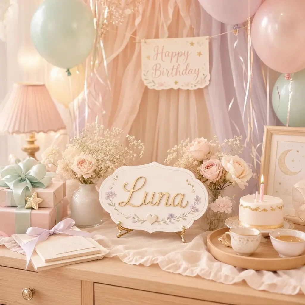
A simple sign with the birthday person’s name or age adds a personal focal point that generic decor can’t provide on its own. It doesn’t need to be expensive or custom made from scratch.
Printable templates in matching pastel tones are widely available and can be printed at home or at a local print shop for a modest cost. A small wooden or acrylic stand for a printed sign is a one time purchase that can be reused and reprinted for future celebrations.
10. Plan for How the Room Looks After Dark
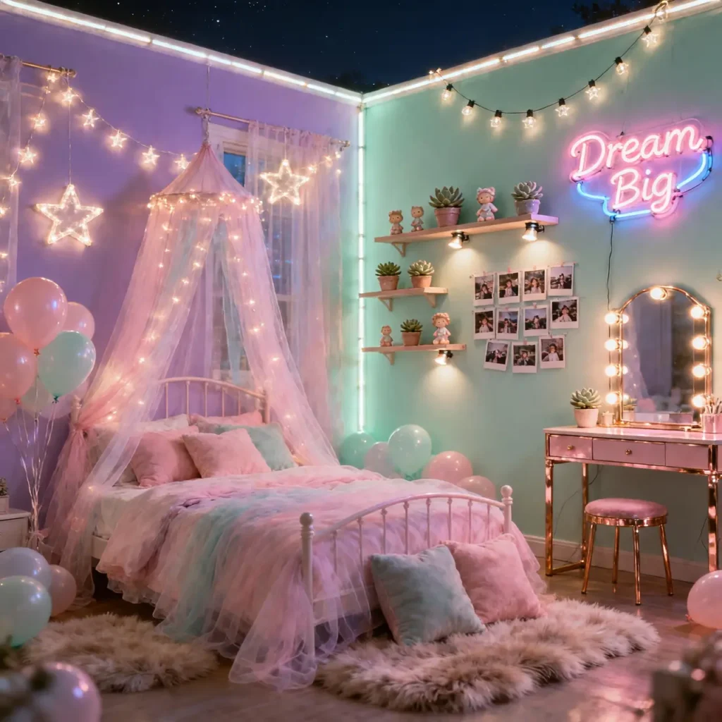
A pastel room that looks beautiful in daylight can lose a lot of its charm once the sun goes down, especially if the lighting plan wasn’t considered ahead of time.
Warm string lights, whether draped along a backdrop or wrapped around a balloon garland, extend the pastel aesthetic into the evening instead of letting it fade into shadow. If the celebration runs past sunset, test the lighting setup in the space beforehand rather than adjusting it last minute once guests have arrived.
Mistakes to Avoid
- Using too many pastel shades at once. Stick to two main tones and one metallic accent rather than combining every soft color available.
- Relying only on overhead lighting. It washes out pastel tones instead of letting them read as warm and soft.
- Choosing a scattered balloon bunch over a garland. A garland fills the same space with far more visual impact for a similar cost.
- Skipping texture. An entirely flat, smooth pastel setup can look one dimensional without added texture.
- Forgetting evening lighting. A room that looks great at 2pm can go flat once it gets dark.
- Overly bright cake frosting. It can clash with a carefully chosen soft pastel backdrop.
Frequently Asked Questions
What pastel colors work best together for birthday decor? Blush pink and sage green, or lavender and cream, are two combinations that read as cohesive rather than scattered. Picking two main tones plus one metallic accent generally works better than combining four or five pastel shades at once.
How many balloons do I need for a pastel balloon garland? Most garland kits are sized by length, and a 6 to 8 foot garland typically uses 60 to 100 balloons in mixed sizes, depending on how full you want the finished look to appear.
Is warm or cool lighting better for a pastel themed room? Warm lighting works better with pastel palettes, since pastel tones are already low contrast and can look washed out under cool, harsh light.
Do I need fresh flowers for pastel birthday decor to look good? No. Quality faux florals in muted, soft tones photograph nearly identically to fresh flowers and can be reused for future events, which often makes them the more practical choice.
How do I keep a pastel table setting from looking too matchy? Mix two pastel tones with one neutral color, like cream or white, rather than using a single pastel shade across every item on the table.
Bringing It All Together
A dreamy pastel birthday room doesn’t require every single idea on this list to look magical. Picking three or four that fit your space and budget, a clear color palette, a balloon garland instead of a scattered bunch, and warm lighting, usually gets a room most of the way there. The details that matter most are the ones that show up clearly in photos: color consistency, texture, and a defined focal point in the room.