
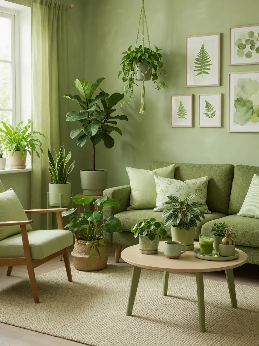
You’ve seen matcha green everywhere this year, on paint swatches, in design roundups, all over home decor social media, and you’re wondering whether it’s actually worth bringing into your own living room or if it’s just another color that’ll feel dated in two years. Matcha green living room ideas are worth taking seriously, since multiple 2026 trend forecasts, from paint brands to interior designers, keep circling back to this specific shade as one of the year’s defining colors, distinct enough from standard sage to feel fresh but still genuinely livable day to day. Here’s how to actually use it well, without ending up with a room that feels like a trend you’ll regret next year.
1. Understand What Makes Matcha Different From Sage Green
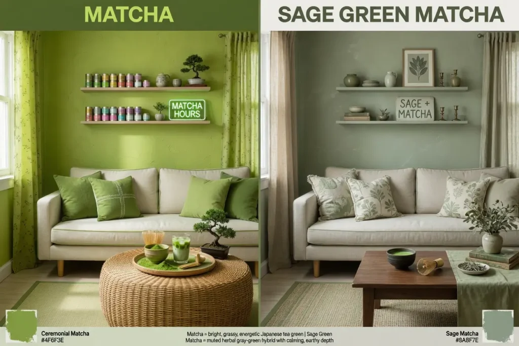
Before painting anything, it helps to know exactly what matcha green is, since it’s easy to assume it’s just another name for sage and end up with the wrong color entirely.
The Real Difference
Sage green tends to be softer and more muted, with a grayish undertone that reads as calm and understated. Matcha leans slightly more saturated and yellow-toned, closer to the actual color of matcha powder, giving it a punchier, more energizing quality even though it’s still firmly in the muted green family. If you’ve already tried sage and found it a little flat or cool for your space, matcha is worth testing as a warmer, livelier alternative rather than assuming any green will give you the same result.
2. Start With a Sample Before Committing to a Full Wall
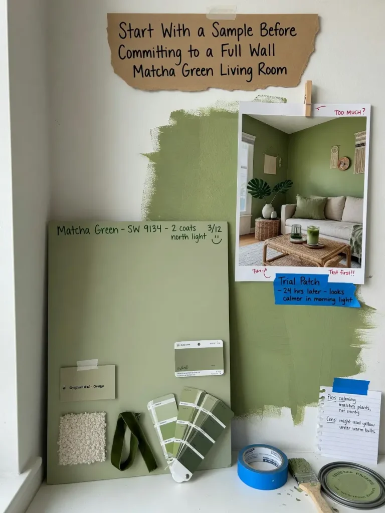
Matcha green shifts noticeably under different lighting, and one interior writer who tested the color in her own living room specifically noted how much the shade changed between morning and evening light before landing on a version she was happy with.
Testing It Properly
Paint a sample directly on your wall, not just a poster board, and view it at multiple points during the day, morning, midday, and evening with your lamps on. North facing rooms with less direct sun will generally show matcha’s cooler, more muted side, while south facing rooms with more warm light will bring out its yellower, more energizing quality.
3. Use Matcha as a Color-Drenched Statement Wall
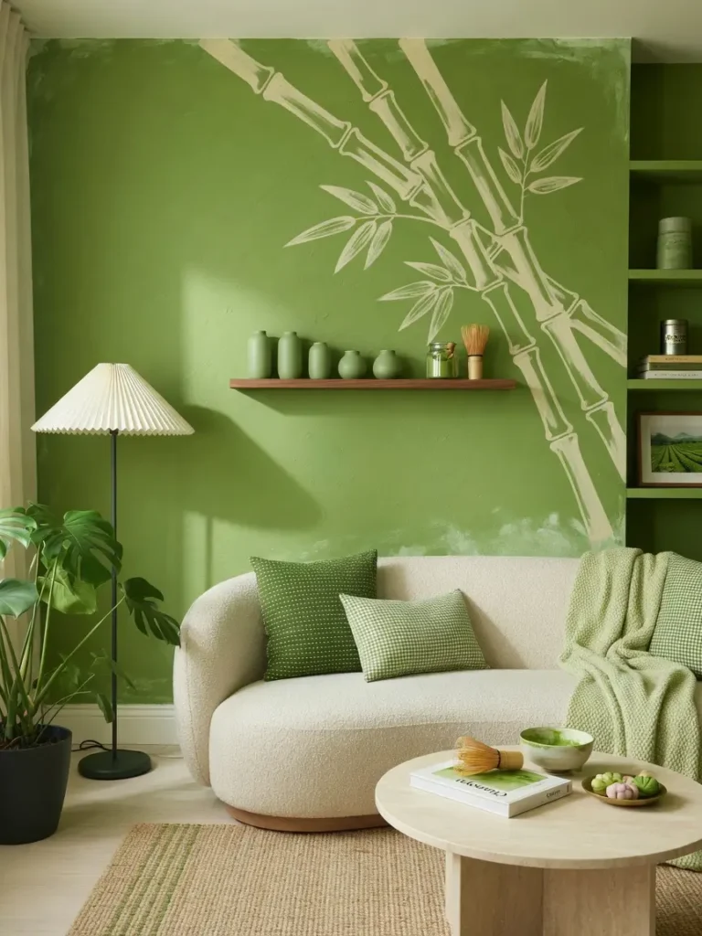
Rather than a single accent wall, current 2026 design coverage increasingly favors color drenching, painting a wall, trim, and sometimes even the ceiling in the same shade, for a cohesive, enveloping effect that reads as more intentional than a single flat wall of color.
This approach works particularly well with matcha, since the color has enough depth to hold a room’s attention without needing pattern or texture layered on top immediately. If a full color-drenched room feels like too much of a commitment, starting with just the wall and trim together, rather than the ceiling too, is a reasonable middle ground.
4. Pair Matcha With Warm Wood Tones
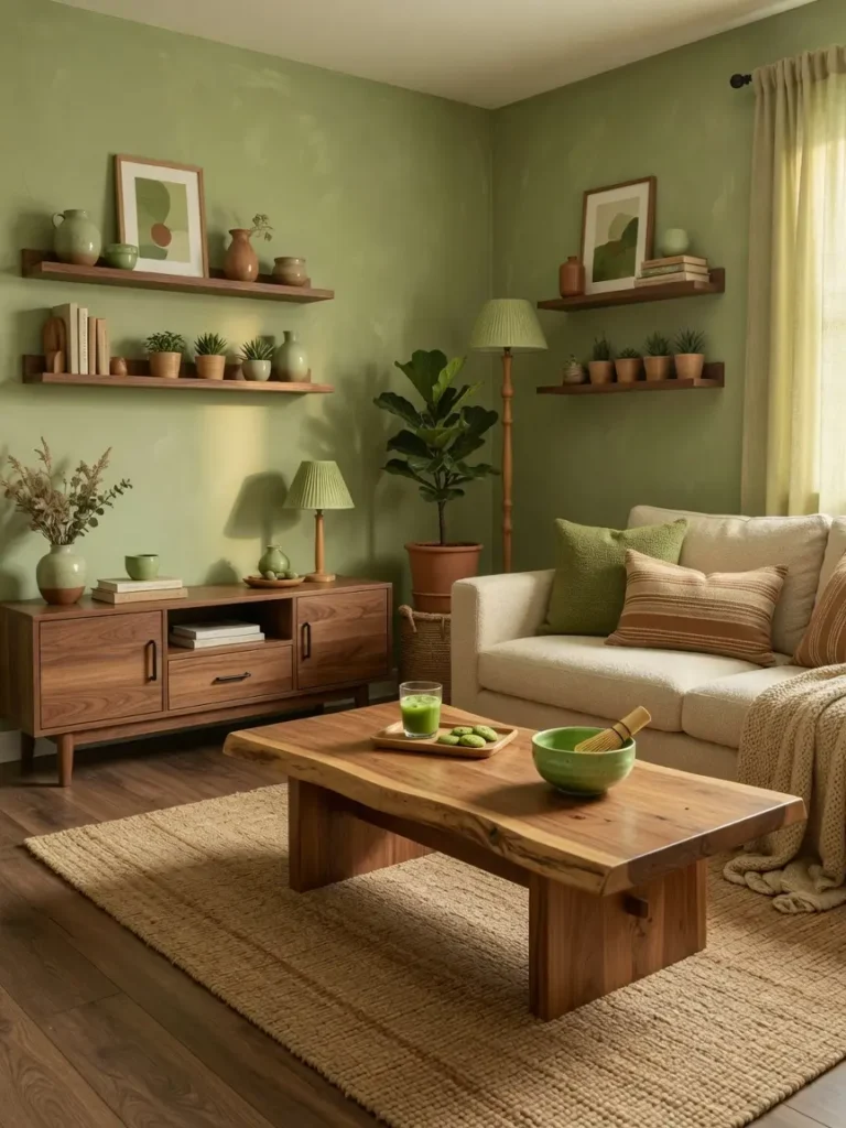
Matcha green consistently pairs well with warm wood, since the wood’s natural warmth balances the slightly cooler, more mineral quality that green tones can bring to a room.
Wood Pairings Worth Trying
Oak and walnut furniture both work well against a matcha backdrop, and a wood coffee table or media console in either tone helps ground the room rather than letting the green feel like it’s floating on its own. This pairing also gives you flexibility, since wood furniture is relatively easy to source in a range of price points compared to committing to fully upholstered matcha furniture.
5. Try Tonal Layering Instead of a Single Flat Green
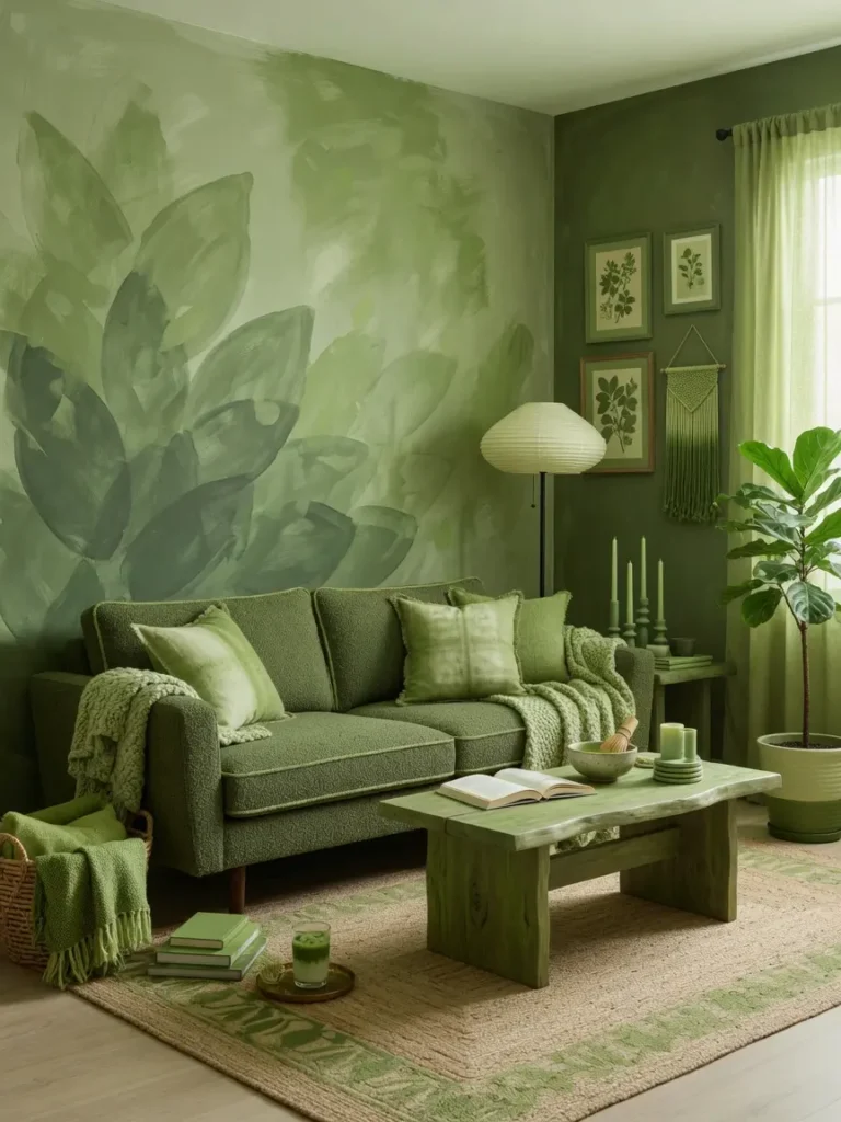
Designers covering 2026 green trends have specifically pointed to tonal variation, layering several shades within the same color family, as more sophisticated than committing a whole room to one flat green.
Building Tonal Depth
Pairing your matcha walls with a slightly deeper olive accent chair, or a lighter pistachio throw pillow, creates depth without introducing an unrelated color into the mix. This approach also gives the room more visual interest over time, since a single flat green surface can start to feel one dimensional once the initial impact of the color wears off.
6. Bring In Plants to Reinforce the Color Story
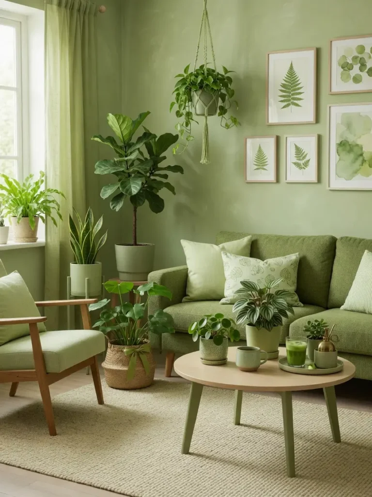
Matcha’s connection to nature makes live plants a particularly natural pairing, and 2026 trend coverage repeatedly mentions greenery as essential to rounding out a green-toned room rather than optional decor.
A few well placed plants, rather than one or two scattered afterthoughts, help tie the wall color into the room’s overall atmosphere. This is also one of the lowest cost ways to commit to the matcha trend without painting anything at all, if you’d rather test the aesthetic through plants and smaller green accents before deciding on a wall color.
7. Use Matcha Sparingly if You’re Not Ready for a Full Commitment
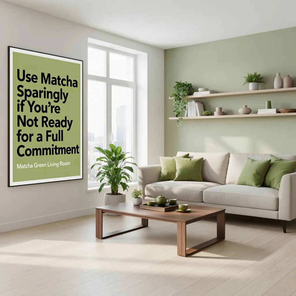
If a fully painted matcha living room feels like too much, the color works just as well introduced through smaller elements, a set of throw pillows, a ceramic vase, a patterned rug with matcha as one of several tones.
Low-Commitment Starting Points
Textiles are the easiest entry point, since they’re simple to swap out if your taste shifts. A patterned accent chair or a set of curtains in a matcha-adjacent tone lets you live with the color for a while before deciding whether you want to commit to it on a larger scale, like a full wall.
8. Pair Matcha With Curved, Soft Furniture Shapes
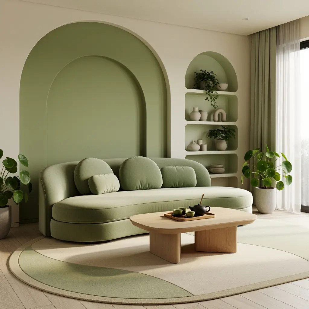
Current 2026 living room trends favor softer, more organic furniture silhouettes, sofas that curve rather than sit at sharp angles, tables with rounded edges, over rigid, boxy shapes from previous years.
This softer furniture style pairs naturally with matcha’s own soft, muted character, avoiding the slightly clinical feeling that a saturated color can sometimes take on when paired with very geometric, hard-edged furniture. A single curved accent chair in a neutral fabric is often enough to introduce this softer shape language without needing to replace an entire seating arrangement.
9. Consider Matcha for North Facing Rooms That Need Warmth
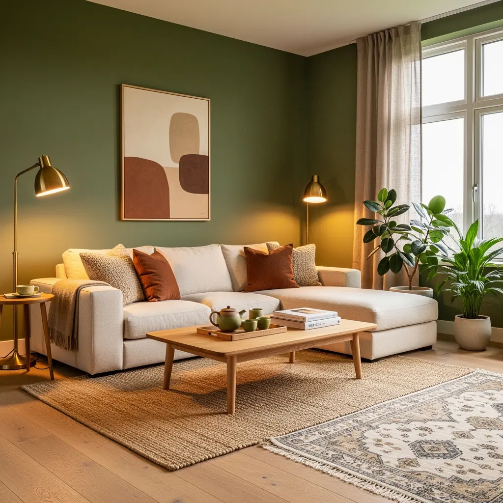
Matcha green’s slightly yellow undertone makes it a genuinely useful choice for rooms that don’t get much direct sunlight, since the warmth in the color can help offset the cooler, flatter light a north facing room typically receives.
Where This Matters Most
If your living room has struggled to feel warm and inviting despite trying various neutral colors, matcha is worth testing specifically because of this undertone, rather than defaulting to another gray or beige that might read as equally cool in the same lighting conditions.
10. Avoid Pairing Matcha With Colors That Fight Its Undertone
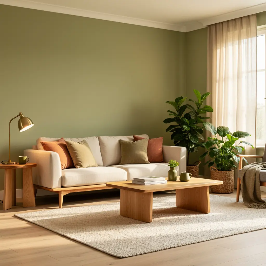
Not every color pairs well with matcha, and current design guidance specifically warns against certain combinations that can make a green room look dated rather than current.
Safer Pairing Choices
Warm neutrals, cream, warm white, tan, generally work better with matcha than stark, cool-toned whites or grays, which can create an unintentional and slightly jarring contrast against the green’s warmth. If you’re unsure whether a specific accent color works, testing fabric or paint swatches together in your actual room lighting is a more reliable method than judging the pairing on a screen.
Mistakes to Avoid
- Confusing matcha with standard sage green. Matcha is more saturated and yellow-toned, so test the actual color rather than assuming any muted green will give the same result.
- Skipping the wall sample test. Matcha shifts noticeably under different lighting conditions, so always test directly on your wall at multiple times of day.
- Using one flat shade with no tonal variation. Layering a few related green tones tends to look more considered than a single uniform color throughout the room.
- Pairing it with cool, stark whites or grays. Warm neutrals generally complement matcha’s undertone better than cool ones.
- Committing to a full room repaint before testing smaller. Textiles and plants are a lower risk way to live with the color before painting an entire wall or room.
- Ignoring your room’s natural light direction. North facing rooms and south facing rooms will show matcha quite differently, so account for this before choosing a specific shade.
Frequently Asked Questions
Is matcha green the same as sage green? No. Matcha is more saturated and has a more yellow undertone, giving it a punchier, more energizing quality compared to sage’s softer, grayer tone.
Will matcha green go out of style quickly? It’s difficult to say with certainty, since trend longevity varies, but current 2026 coverage treats muted, tonal greens broadly as part of a longer shift away from stark neutrals rather than a single fleeting color moment, which suggests some staying power beyond just this year.
What furniture colors pair best with a matcha green living room? Warm wood tones like oak and walnut, along with warm neutrals like cream and tan, tend to complement matcha better than cool grays or stark white.
Is matcha green a good choice for a room with limited natural light? It can be, particularly for north facing rooms, since the color’s warm undertone can help offset cooler, flatter daylight better than another gray or beige might.
How can I try matcha green without committing to a full room repaint? Start with textiles, pillows, a throw blanket, a patterned rug, or bring in a few plants to test the aesthetic before deciding whether to commit to a painted wall or a full color-drenched room.
Bringing It All Together
Matcha green living room ideas don’t require jumping straight to a fully painted, color-drenched space to be worth trying. Starting with a proper wall sample tested in your actual lighting, paired with warm wood furniture and a few plants, gives you a realistic sense of whether the color genuinely works in your space. From there, tonal layering, the right neutral pairings, and a bit of patience with how the color shifts throughout the day are what separate a matcha living room that feels current and considered from one that feels like a trend picked without much thought.

Leave a Reply