10 Moody Navy Home Decor Ideas That Feel Rich, Not Dark
You’ve painted a wall a deep navy blue expecting drama and sophistication, and instead the room feels heavy and closed in by evening. Moody navy home decor ideas can absolutely deliver that rich, dramatic look, but the difference between a navy room that feels intentional and one that just feels dark usually comes down to lighting, contrast, and where exactly the color gets used.
This guide covers ten specific ways to bring navy into a home so it reads as moody in the best sense, layered and warm, rather than simply dim. Navy has a reputation for being a safe, versatile neutral that still carries real depth, which is exactly why it shows up so often in libraries, dining rooms, and studies where a sense of intimacy is the goal rather than brightness. Getting the details right just takes a bit more intention than reaching for a paint chip and calling it done.
1. Pair Navy With a Warm, High Contrast Trim Color
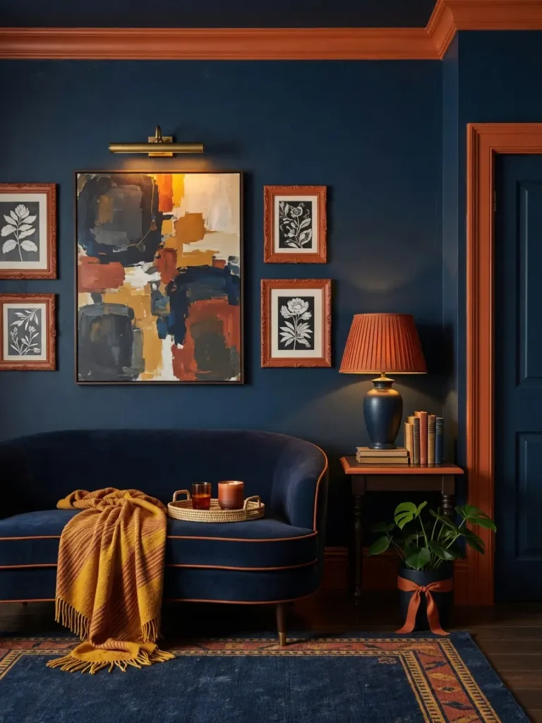
A navy wall paired with a bright white or warm cream trim creates the contrast that keeps the room from feeling like one flat, dark block. Skipping the trim contrast, or painting the trim the same navy as the wall, tends to make a room feel heavier and less defined.
Choosing the Right White
A slightly warm white, rather than a stark, cool toned white, tends to complement navy’s coolness better and avoids an overly stark, clinical contrast.
2. Use Navy on Just One Wall in Smaller Rooms
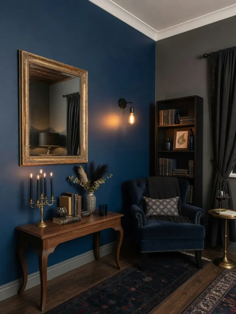
In a smaller room with limited natural light, painting all four walls navy can feel overwhelming. A single navy accent wall, especially one that isn’t directly opposite the main light source, gives you the dramatic effect without sacrificing the overall brightness of the room.
3. Layer in Brass or Gold Hardware for Warmth

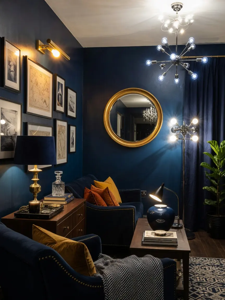
Navy is a cool, deep color on its own, and pairing it with warm metals like brass or gold cabinet hardware, light fixtures, or picture frames balances that coolness with warmth. This pairing is part of why navy libraries and studies, a classic use of the color, so often include brass reading lamps and hardware.
4. Add Texture Through Velvet or Boucle Upholstery
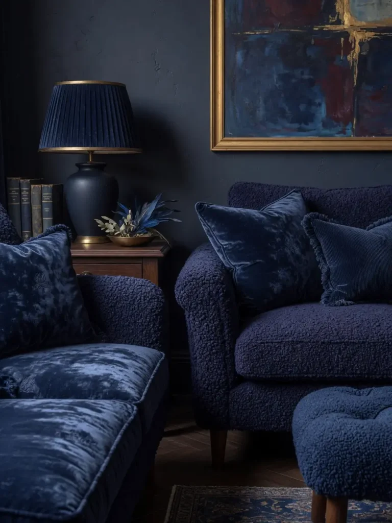
A navy sofa or accent chair in a flat, smooth fabric can look one dimensional under changing light. Velvet or boucle upholstery in navy catches light differently depending on the angle, which adds richness and depth that a smooth cotton or linen fabric in the same color doesn’t achieve as effectively.
Where Texture Matters Most
Large upholstered pieces benefit the most from a textured navy fabric, since they cover the most visual real estate in a room and have the most opportunity to look flat without it.
5. Use Navy in Rooms With Strong Artificial Lighting
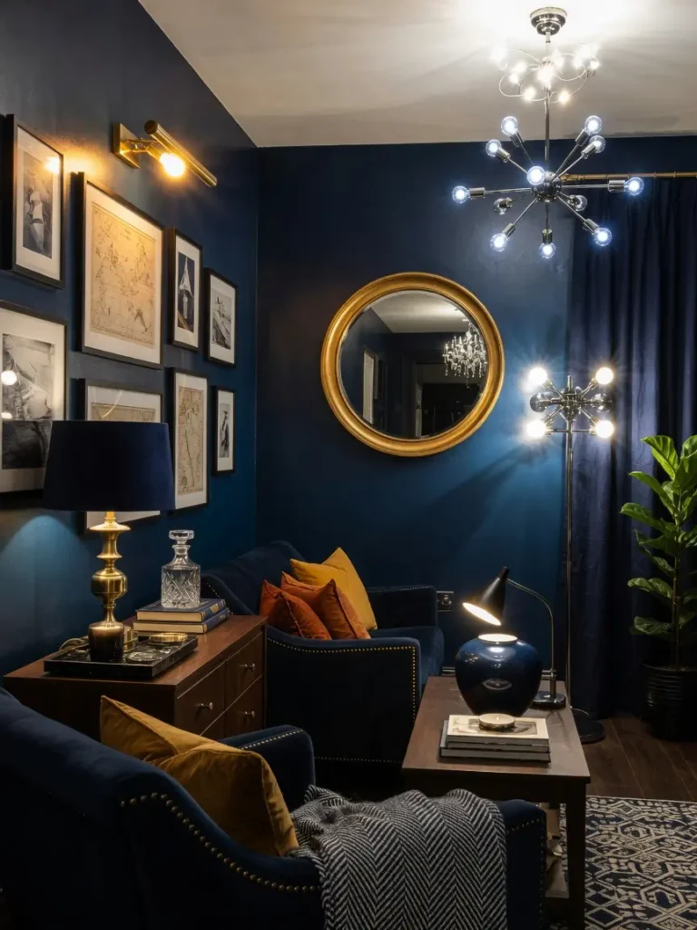
Navy tends to work best in rooms that get supplemental lighting beyond just a single overhead fixture. A dining room with a statement chandelier, a study with a reading lamp and a floor lamp, or a bedroom with layered bedside lighting all give navy walls enough light to read as rich rather than dim once natural light fades in the evening.
6. Balance Navy With Natural Wood Tones
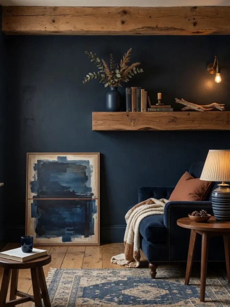
Navy paired with cool gray tones can feel cold and uninviting, while pairing it with warm wood, like a walnut bookshelf, an oak dining table, or wood floors, grounds the color and keeps the space feeling warm despite the depth of the blue. This combination is common in traditional libraries and dens for exactly this reason, and it’s part of why navy so often gets described as a color that feels both sophisticated and welcoming rather than cold, provided it’s paired with the right materials around it.
7. Introduce Navy Through Textiles Before Committing to Paint
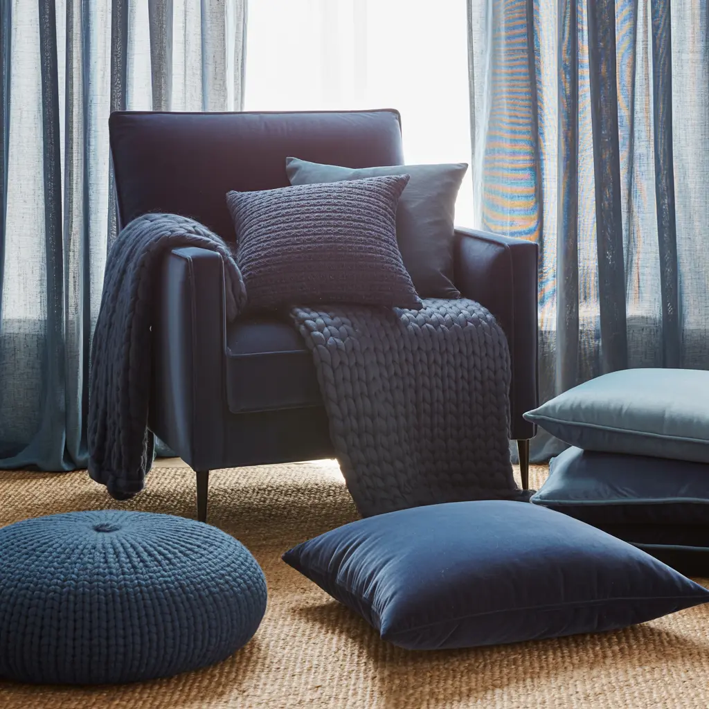
For a lower risk way to test whether you’ll actually like navy in a space, start with a navy throw pillow, a rug, or curtains rather than repainting an entire wall. This lets you live with the color at a smaller scale and see how it reads in your specific lighting before making a larger commitment.
Where Textiles Work Best
Curtains are a particularly effective testing ground, since they interact directly with the room’s natural light throughout the day and give a strong sense of how the color will feel at different times.
8. Use Navy Tile in a Kitchen or Bathroom Backsplash
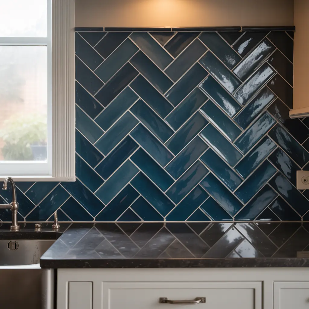
Navy subway tile or a navy mosaic backsplash brings the color into a smaller, contained area, which tends to read as sophisticated rather than overwhelming. This works particularly well against white cabinetry or countertops, where the contrast does most of the visual work.
9. Add Metallic or Glass Accents to Bounce Light
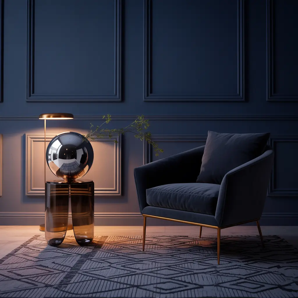
Since navy absorbs more light than a pale neutral, adding reflective surfaces, a mirrored tray, a glass lamp base, or metallic picture frames, helps bounce available light back into the room rather than letting the navy absorb everything. This is a particularly useful trick in a smaller or darker room where you still want to use navy, since even a few small reflective touches can noticeably lift how the whole space feels once evening light sets in.
10. Choose the Right Navy Undertone for Your Room’s Light
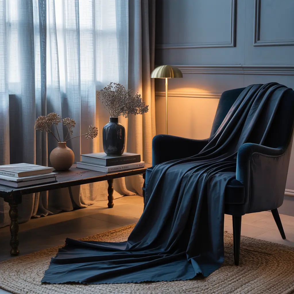
Some navy paints lean slightly purple, others lean more toward a true blue or even a blue green. A room with warm afternoon light generally suits a navy with a slightly warmer undertone, while a cooler, north facing room can handle a more blue leaning navy without looking flat.
Mistakes to Avoid
- Painting an entire small, dark room in navy without supplemental lighting to balance it
- Skipping trim contrast, which makes a navy room feel like one heavy block of color
- Pairing navy only with cool grays instead of warm woods and metals
- Choosing a completely flat, matte fabric for large navy upholstered pieces
- Committing to a full room in navy without testing the color through textiles first
- Ignoring your room’s natural light direction when choosing a specific navy undertone
Frequently Asked Questions
Does navy make a small room feel smaller? It can, especially without enough supplemental lighting or contrast. A single accent wall, strong artificial lighting, and warm trim contrast all help keep a navy room from feeling closed in.
What colors pair best with navy for a warm, moody look? Brass, warm wood tones, cream, and a warm white trim all pair well with navy and help balance its cool, deep base tone.
Is navy a good color for a bedroom? Yes, navy is a popular bedroom color specifically because its depth can feel calming and cocoon like, especially when paired with warm bedside lighting and layered textiles.
Can I use navy in a room without much natural light? Yes, but it works best paired with strong artificial lighting, since a navy room relying only on dim natural light can start to feel more dark than moody.
How do I test navy before committing to a full wall? Start with a navy throw pillow, a rug, or curtains, which let you live with the color at a smaller scale before deciding whether to paint a full wall or room.
Conclusion
Moody navy home decor works best when it’s paired with contrast, warmth, and enough light to let the depth of the color read as rich rather than dim. Start with textiles to test the tone in your space, then build toward paint or tile once you understand how it interacts with your room’s specific lighting. The right balance of warm accents and contrast is what separates a navy room that feels dramatic from one that just feels dark. Give yourself permission to start small, a single pillow or a set of curtains, and let your confidence with the color build gradually rather than repainting an entire room in one weekend based on a photo you saw online.