
You paint a wall blush pink because you saw it in a photo and it looked calm and a little romantic. Then it dries, and somehow it reads more like a birthday party than a bedroom. That gap between the inspiration photo and the actual wall is almost always about undertone, not the color itself, and it is exactly what these blush pink bedroom wall decor ideas are meant to fix. The goal here isn’t just picking a paint chip. It’s building a wall that has enough texture, contrast, and warmth that the pink reads as sophisticated instead of saccharine.
Blush pink gets a bad reputation because most people use it flat, on every wall, with nothing else going on. One color, one finish, done. That’s the mistake. A blush pink bedroom that actually works has layers: the right undertone, some texture, a mix of warm metals, and lighting that doesn’t wash the whole thing out. Below are ten specific ways to get there.
1. Choose the Right Shade of Blush Pink for Your Walls
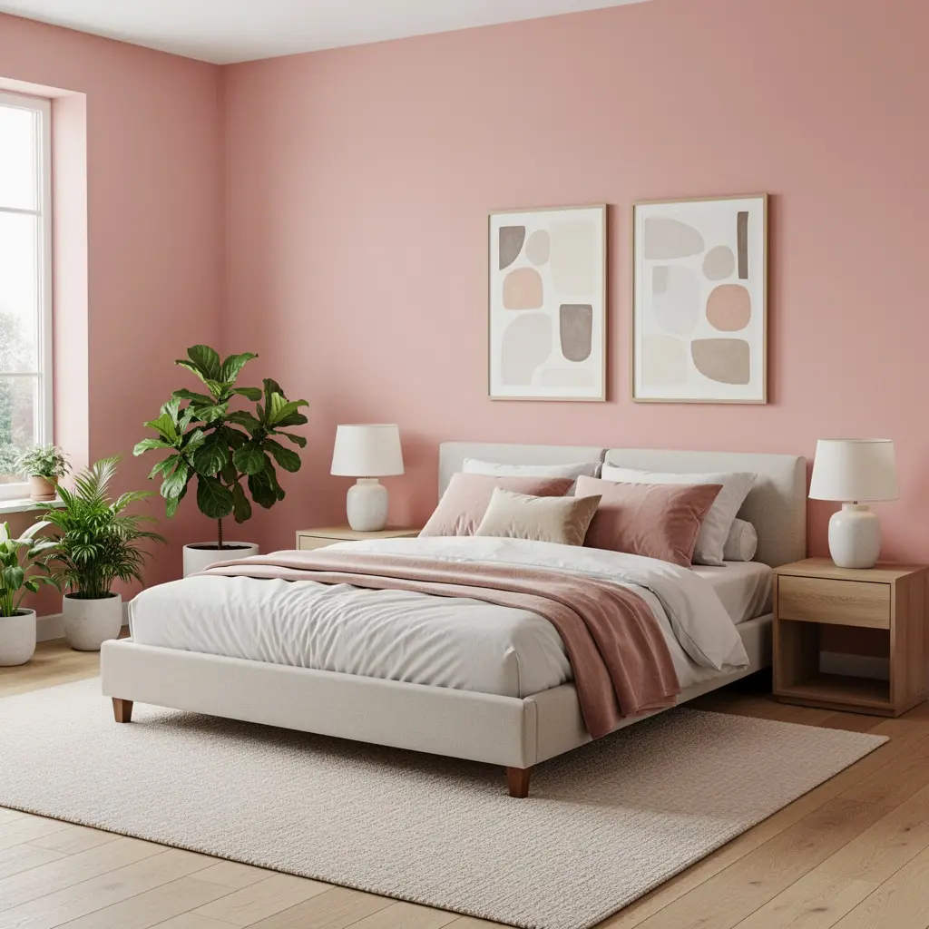
Not all blush pinks are equal, and this is where most bedrooms go wrong before a single piece of decor goes up. Pinks with a peachy or beige undertone, rather than a cool, bluish undertone, tend to read as warm and grounded instead of candy sweet. Look for names that hint at clay, terracotta, or dusty rose rather than “cotton candy” or “bubblegum.”
A useful trick is to test the paint in your actual room, not just on a chip in a store under fluorescent lighting. Paint a sample patch roughly two feet by two feet on the wall that gets the most natural light, and check it in the morning, midday, and evening. Blush pink can shift dramatically depending on whether your room faces north or south.
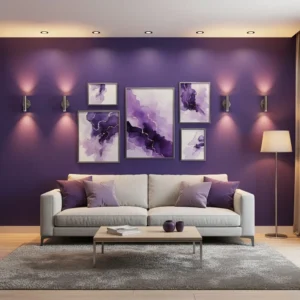
Why Undertone Changes Everything
A cool toned blush next to white trim and gray furniture can start to feel clinical or a little cold, almost like a hospital nursery. A warm toned blush next to wood tones, cream linens, and brass hardware settles into the room instead of standing out from it. If you’re unsure, hold your paint sample next to a piece of raw or lightly stained wood furniture. If it looks muddy or off, that’s a sign the undertones are clashing.
2. Build a Gallery Wall That Doesn’t Look Like Every Other Pinterest Board
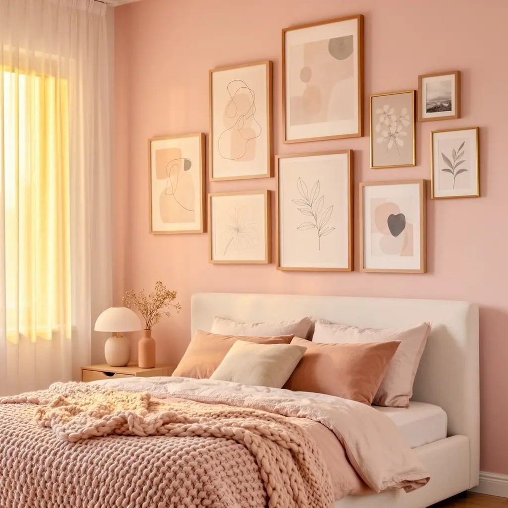
A gallery wall is one of the fastest ways to add depth to a blush pink wall, but a grid of six identical frames in a straight line can flatten the whole effect. Mix frame sizes, ranging from a small 5 by 7 inch frame up to a larger 16 by 20 inch piece, and vary the frame material between a few in warm wood and one or two in a matte black or brushed brass finish.
Keep the spacing between frames consistent, generally 2 to 3 inches apart, even if the frames themselves are different sizes. That consistency is what keeps a mismatched gallery wall looking intentional instead of thrown together.
A Simple Layout That Works
Start with your largest piece slightly off center, then build outward with medium and small pieces in a loose triangle shape rather than a perfect grid. It sounds fussier than it is. Lay the frames out on the floor first, take a photo from above, and adjust before you put a single nail in the wall.
3. Mix Blush Pink With Warm Neutrals So the Room Doesn’t Feel Sugary
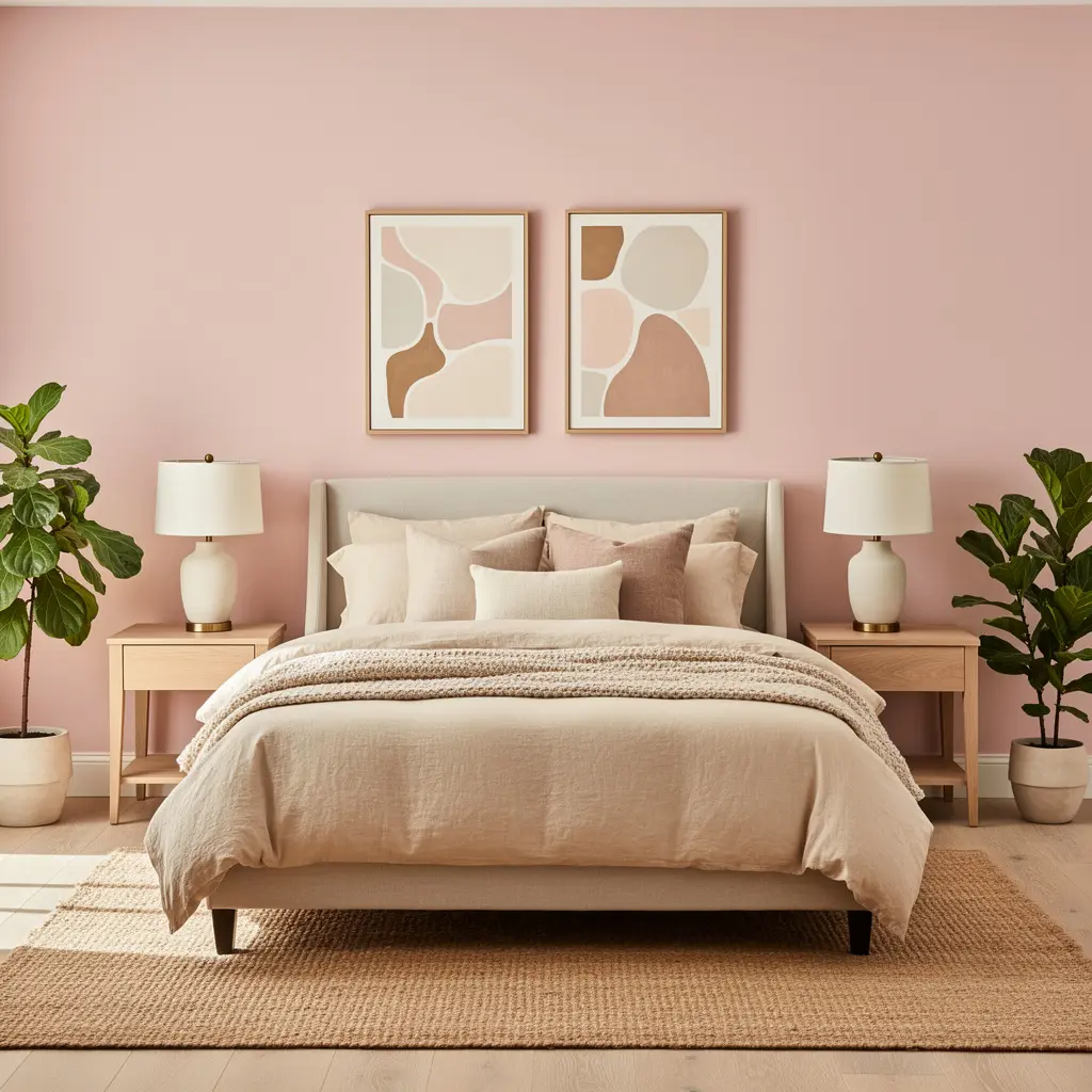
A blush wall on its own, with white everything else, can drift toward feeling like a single note. Warm neutrals such as cream, oatmeal, taupe, and soft camel give the pink something to sit against, so it reads as one part of a palette instead of the whole story. Think of the wall as the backdrop, not the entire outfit.
Bedding in a warm ivory or oatmeal tone, combined with a jute or wool blend rug, pulls the eye away from the pink just enough that the room feels layered. And a little contrast goes a long way here. Even one deep walnut or espresso toned piece of furniture, like a nightstand or headboard, keeps the whole room from floating into pastel territory.
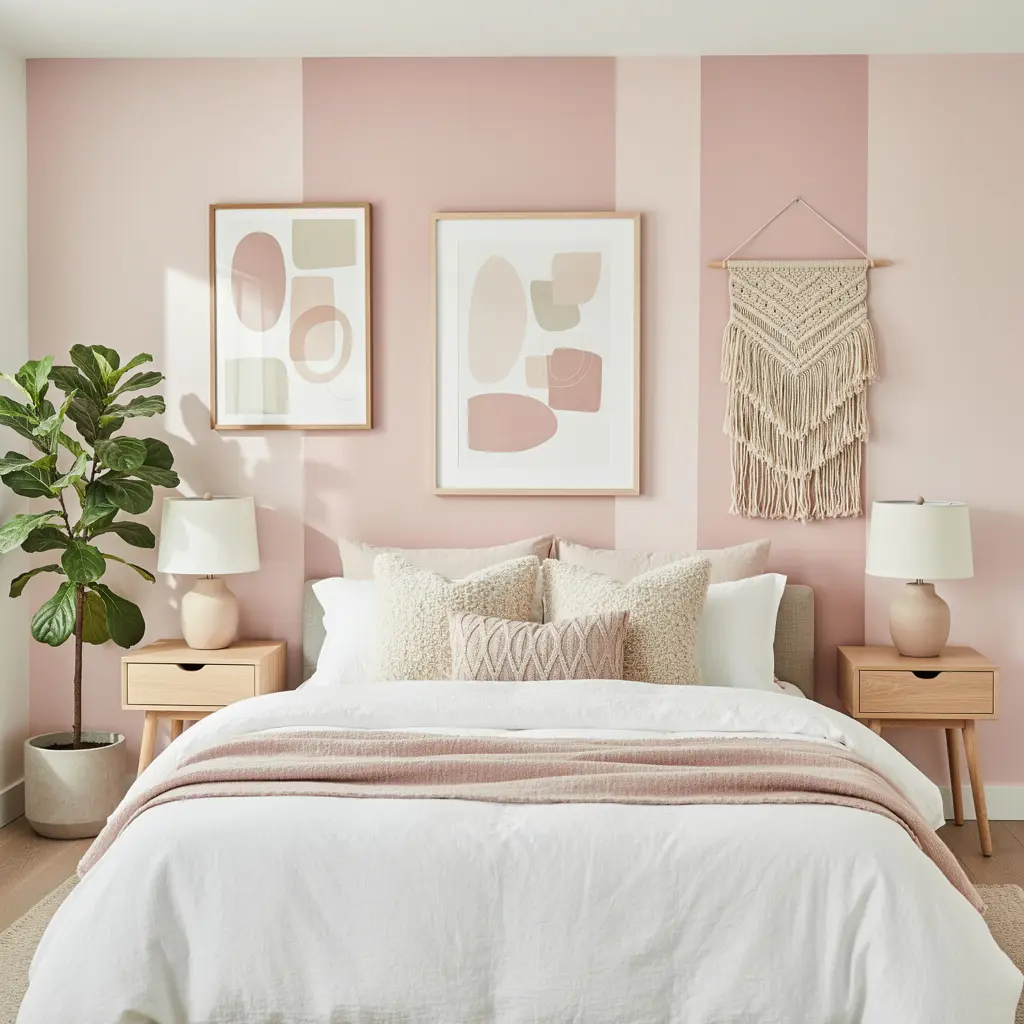
4. Add Texture With Woven and Fabric Wall Hangings
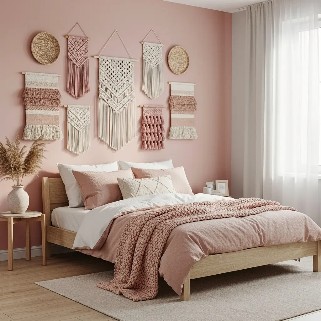
Flat paint next to flat art can feel one dimensional, even with a great color choice. A woven wall hanging in natural jute, cotton, or a blend, priced generally in the 30 to 90 dollar range depending on size, adds dimension that a framed print alone can’t give you.
Look for pieces with visible knots, fringe, or varied texture rather than a smooth, printed fabric panel. That texture catches light differently throughout the day, which keeps the wall from looking static.
5. Use Mirrors to Bounce Light Around a Blush Pink Room
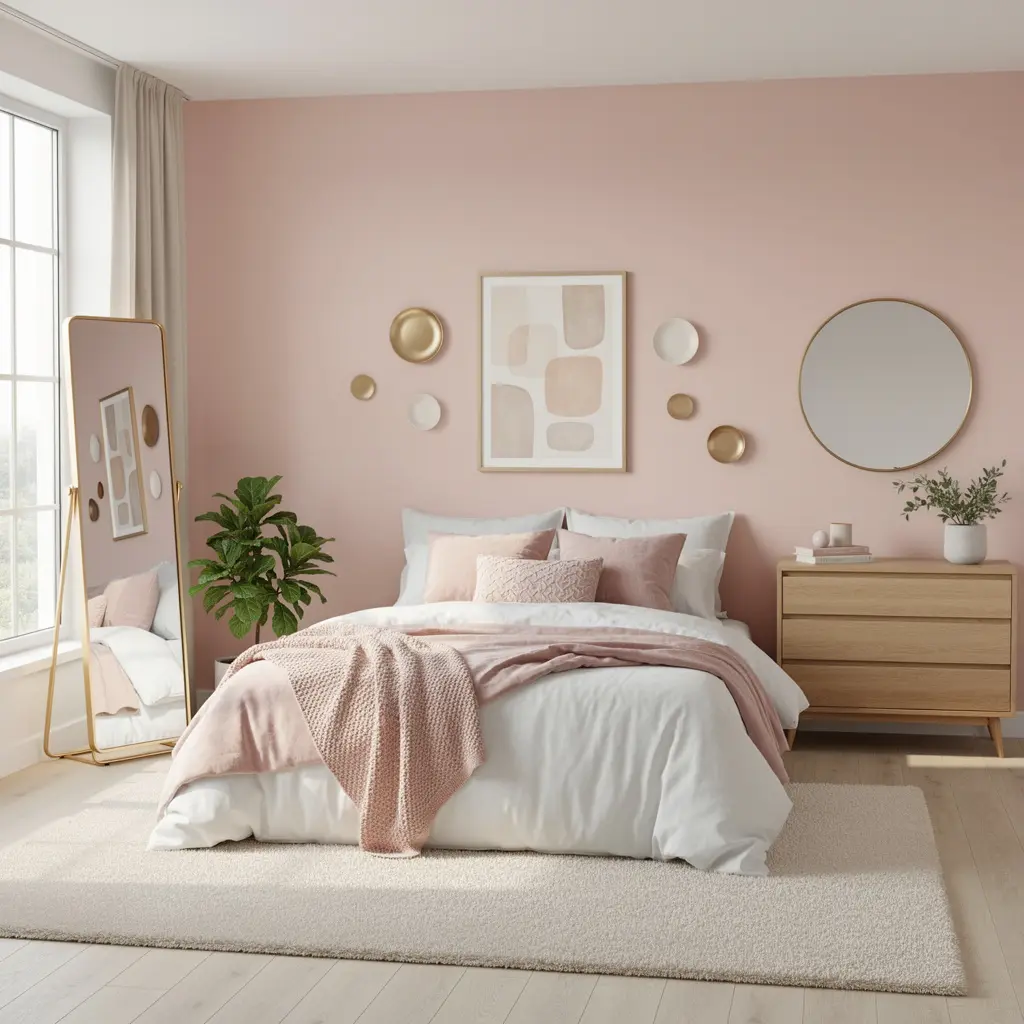
Pink walls, especially in a smaller bedroom, can feel a little enclosed if the room doesn’t get much natural light. A mirror placed across from or near a window helps bounce light back into the space, which keeps the blush from feeling heavy or dim in the evening.
An arched or round mirror in a brass or wood frame tends to soften the geometry of a bedroom, which already has a lot of straight lines from the bed frame and dresser. Mirrors in the 24 to 36 inch range work well as a focal point without overwhelming a standard sized wall.
6. Pick Metal Accents That Actually Complement Pink Instead of Fighting It
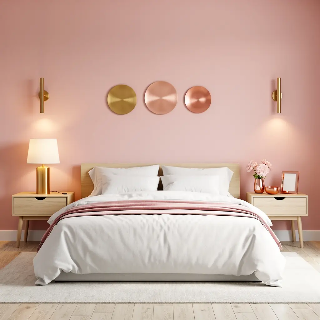
Chrome and cool toned silver hardware can clash with a warm blush wall, making both look slightly off. Brushed brass, warm gold, and even matte black tend to sit better against blush pink because they lean warm or neutral rather than cool.
Consistency matters more than the specific metal you choose. Picking one metal tone and repeating it across your sconces, frame hardware, and any decorative hooks keeps the wall from feeling like a mismatched collection of random pieces.
7. Layer in Botanical and Dried Floral Wall Art
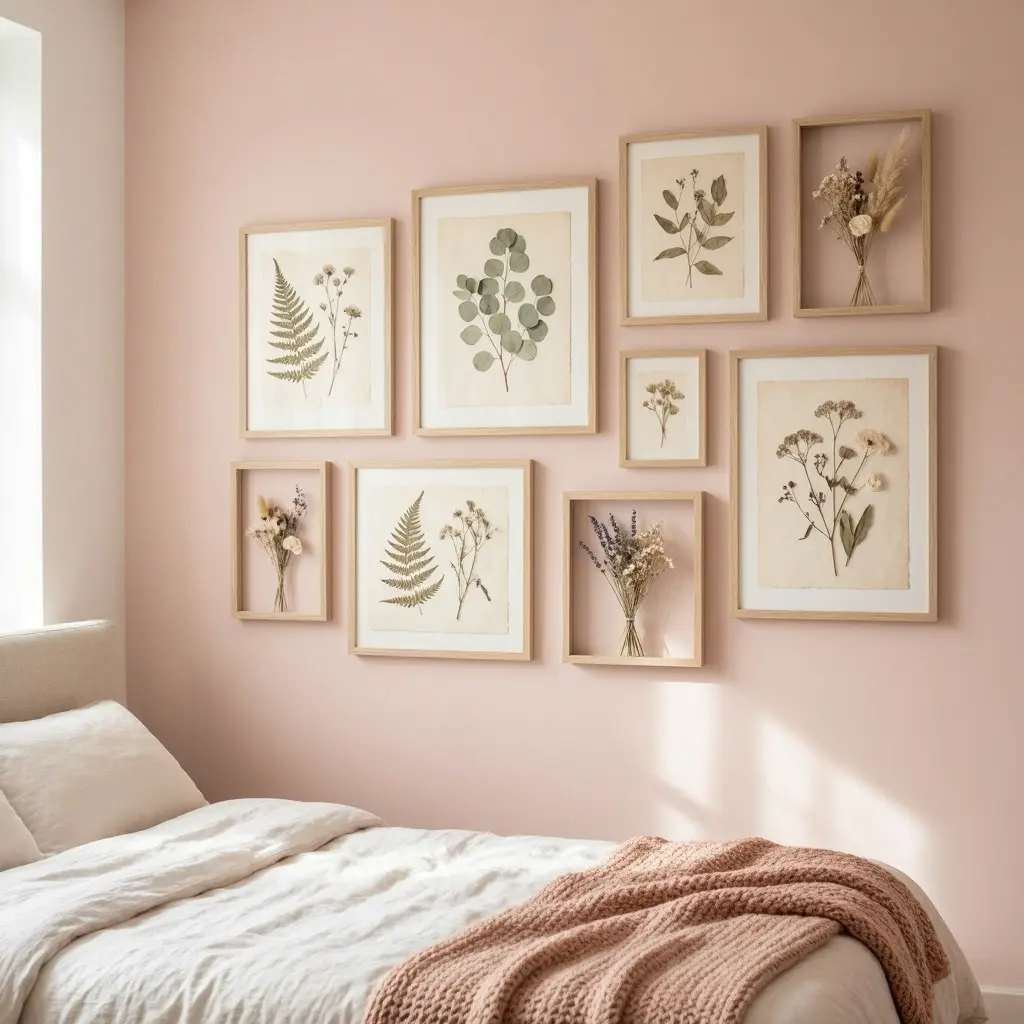
Dried floral arrangements in a wall mounted vase or a pressed botanical print add a organic, slightly imperfect element that keeps blush pink from feeling too polished or artificial. Pampas grass, dried eucalyptus, and bunny tail grass are common, low maintenance choices that hold their shape for months without needing water.
A single dried arrangement in a simple ceramic or glass wall vase, priced generally in the 20 to 45 dollar range, can do more visual work than several small framed prints combined.
8. Try an Accent Wall Instead of Painting the Whole Room
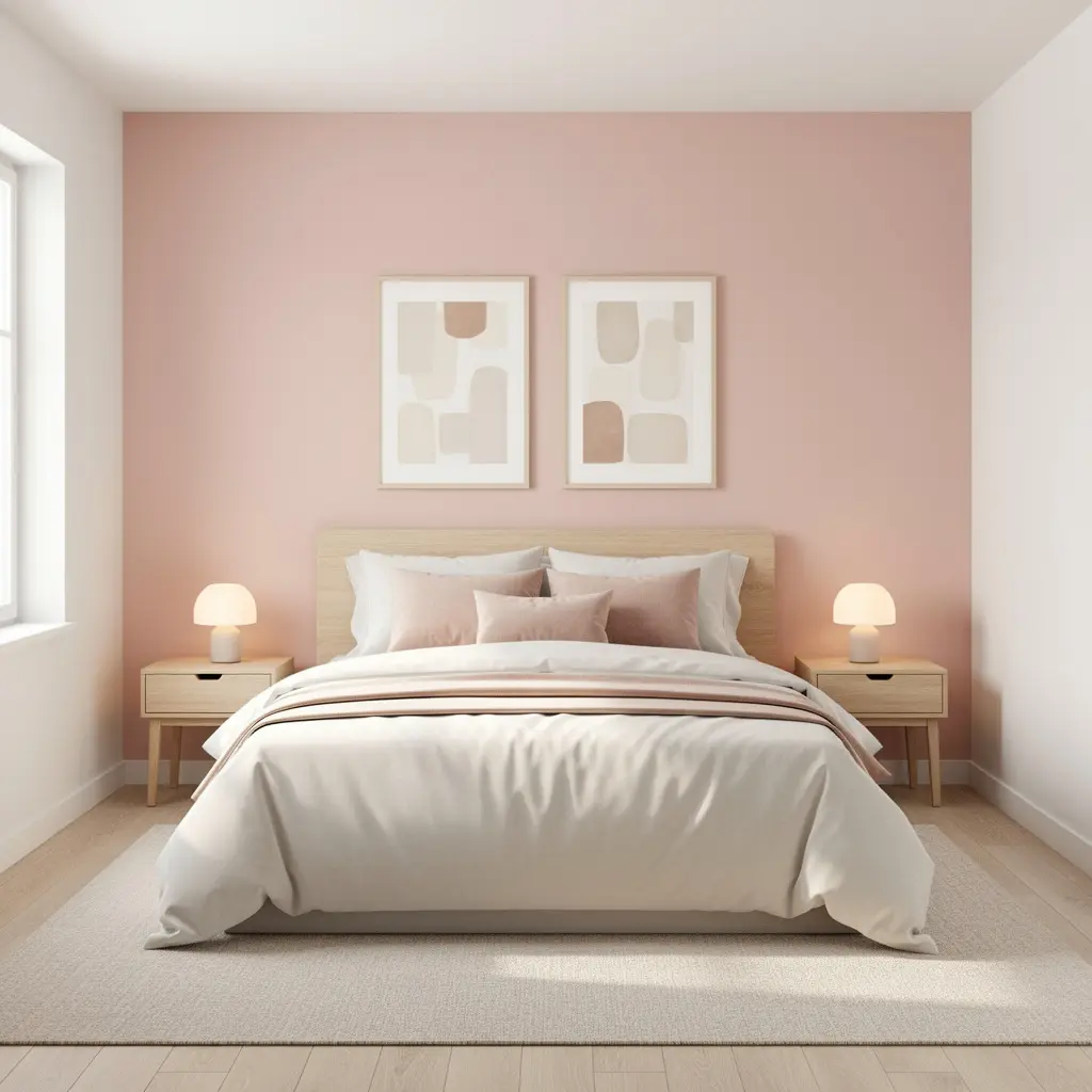
If a full blush pink bedroom feels like too much commitment, one accent wall, usually the wall behind the headboard, gives you the color without it taking over every surface. This also tends to photograph better and feels less overwhelming day to day, since the other three walls stay neutral.
Where to Stop the Paint
Stop the accent color at a clean edge, either where the wall meets a corner or at a defined architectural line like a door frame. Painting only part of one wall, without a clear stopping point, usually looks unfinished rather than intentional.
9. Add Wall Sconces and Lighting That Flatters Pink Tones
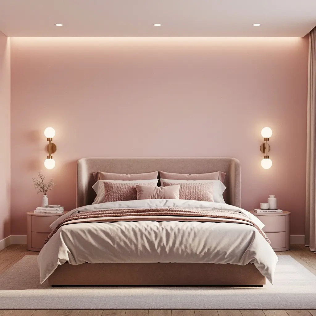
Cool, blue toned LED bulbs can make blush pink look washed out or slightly gray, especially at night. Bulbs in the 2700K to 3000K range, labeled as warm white or soft white, keep the pink looking rich instead of flat.
A pair of wall mounted sconces flanking a headboard or dresser mirror adds both function and a decorative layer, and it takes pressure off a single overhead fixture to do all the lighting work in the room.
10. Get the Look Without Painting, for Renters and Commitment Phobes
If painting isn’t an option, removable wallpaper in a blush pink tone, priced generally in the 25 to 60 dollar per roll range, gives you the same visual effect without touching the lease. Peel and stick options have improved significantly and can look convincingly like paint from a few feet away.
Fabric wall panels or a large tapestry in blush tones are another no damage option, and they double as texture and sound dampening in a room with hard floors.
Mistakes to Avoid
- Choosing a cool toned pink under store lighting without testing it in your actual room
- Pairing blush walls with cool silver or chrome fixtures, which can make the pink look dull
- Using only cool white LED bulbs, which flatten the warmth in the wall color
- Filling a gallery wall with frames that are all the same size and evenly spaced in a rigid grid
- Skipping texture entirely and relying only on flat framed prints
- Painting an accent wall without a clean stopping edge, which reads as unfinished
Frequently Asked Questions
Does blush pink make a bedroom look smaller? Not necessarily. A lighter, warm toned blush paired with good natural or warm artificial light tends to open a room up rather than close it in. Darker or more saturated pinks used on all four walls without contrast are more likely to make a small room feel tighter.
What colors pair best with blush pink bedroom walls? Warm neutrals like cream, oatmeal, and taupe, along with wood tones and brass or gold metal accents, tend to work best. Cool grays and silver tones can clash with the warmth in most blush shades.
Is blush pink too feminine for a shared bedroom? A warm, muted blush paired with deeper wood furniture, black or dark metal accents, and minimal florals reads more neutral and can work well in a shared space. The femininity of the color comes largely from how sweet or saturated the shade is and what it’s paired with.
How do I keep blush pink from looking dated in a few years? Lean toward a muted, warm shade rather than a bright or pastel version, and keep your decor pieces, like frames and hardware, in classic finishes such as brass or matte black rather than trend specific pieces. The wall color will age better if the accents around it are timeless.
Can I use blush pink in a small bedroom without it feeling overwhelming? Yes, especially as a single accent wall rather than covering the whole room. Keeping the ceiling and remaining walls in a light neutral, and adding a mirror to bounce light, helps a blush accent wall feel intentional rather than closing the room in.
Conclusion
A blush pink bedroom wall doesn’t need six matching accessories or a full pastel theme to work. It needs the right undertone, some texture, warm lighting, and a few pieces that don’t all match perfectly. Start with a sample patch on your actual wall before committing to a full gallon, then build outward with one gallery wall, one lighting change, and one textured piece at a time. That slower approach almost always looks more finished than trying to style the whole wall in a single weekend.

Leave a Reply