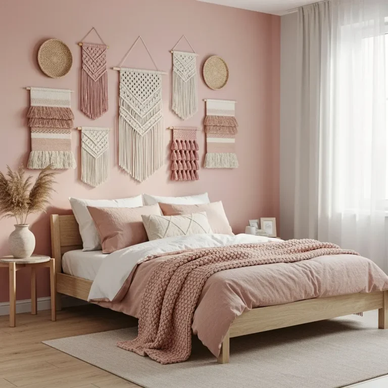
10 Modern Wall Decor Ideas You’ll Want to Copy Today
There’s a fine line between a wall that looks clean and intentional and one that just looks unfinished. Most people, scared of clutter, land on the wrong side of that line. They leave everything bare, and the room ends up feeling cold instead of calm. That’s not really what modern style is going for, even though it gets mistaken for “less is more” all the time, and that mistake shows up on a lot of otherwise well decorated walls.
Modern style, applied to walls specifically, really just means fewer decisions made with more intention. One great piece of art does more for a room than five decent ones scattered around it. That’s basically the whole philosophy behind everything below, and it’s simpler to apply than it might sound at first.
1. Choose Oversized Art Instead of Several Small Pieces
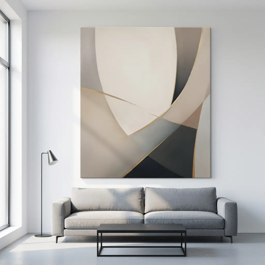
Go big. A single large piece, something in the 40 to 60 inch range, gives a wall a real focal point in a way that five smaller frames never quite manage. Above a sofa or a bed, this is usually the move, and it’s one a lot of people talk themselves out of because a big piece feels like a bigger commitment.
And no, it doesn’t have to cost a fortune. A large scale print from a more affordable source does the same visual job as an expensive original. Scale matters more than the price tag here.
2. Add a Gallery Wall With a Clean, Grid Based Layout
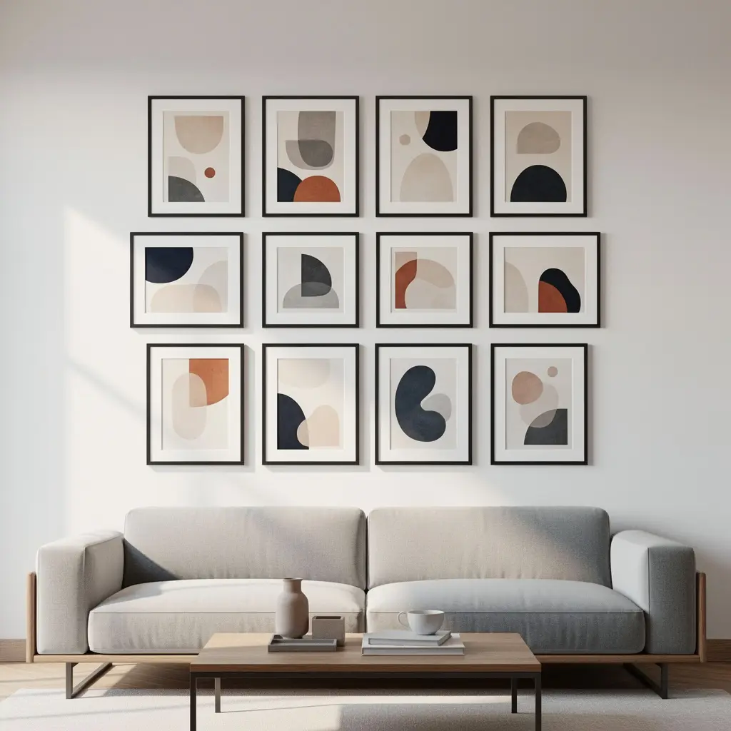
Forget the eclectic, mismatched gallery style you see everywhere else. A modern gallery wall wants a strict grid. Equal spacing, matching frame sizes, no exceptions. It reads as far more contemporary than a loose, organic layout ever will.
Stick to one frame color across the whole thing, all black or all white, nothing in between. Keep the art itself in a tight palette too, black and white photography works well here, so the grid feels like one cohesive piece instead of a bunch of random prints someone hung up over time.
3. Use Geometric Shapes and Abstract Prints
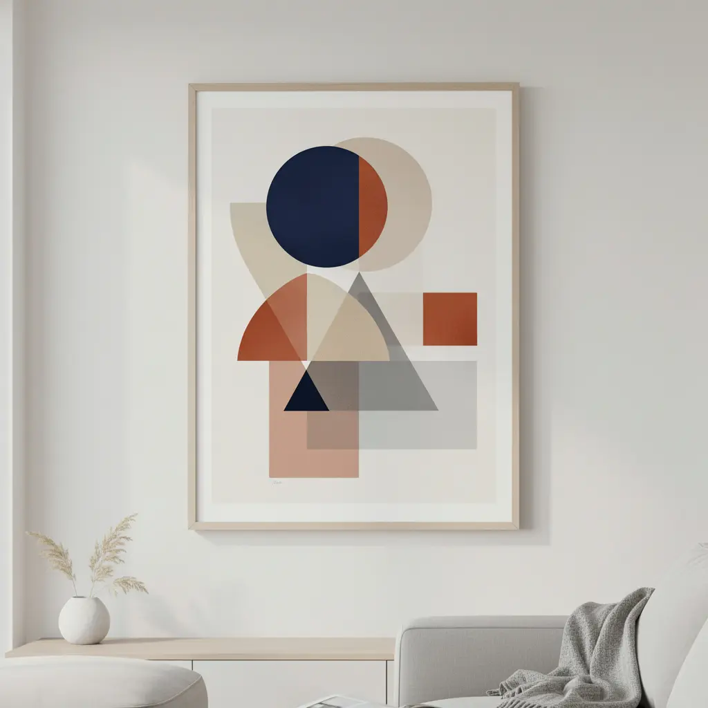
Clean lines. That’s the whole game with modern style, and it shows up in art just as much as furniture. Abstract prints with strong shapes and a tight color palette fit a modern room a lot better than detailed, realistic art, which almost always ends up reading as busier by comparison.
A circular frame. A hexagonal one. Something asymmetrical. These shapes add interest on their own, without needing a bunch of other decor around them to feel finished.
4. Add Dimension With Sculptural or 3D Wall Art
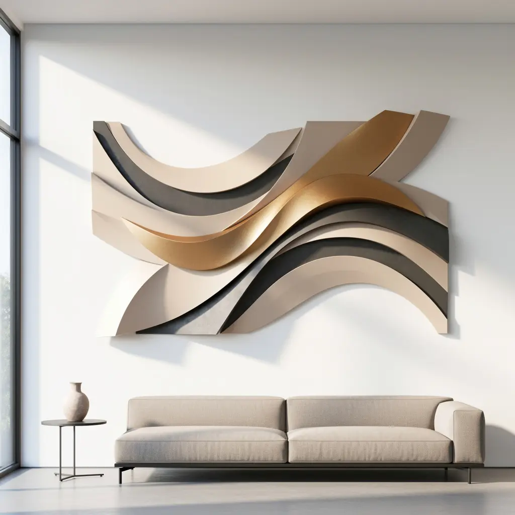
Flat art gets old fast on a big wall. It starts to feel one note after a while, no matter how good the piece is. Sculptural wall art, metal, wood, whatever material, adds actual dimension, and it catches light differently as the day goes on, so the wall never feels totally static.
One piece is enough. Save it for a single statement spot rather than spreading a few smaller sculptural pieces around the room. One well placed piece beats three competing for attention every time.
5. Choose a Statement Mirror in a Sleek Frame
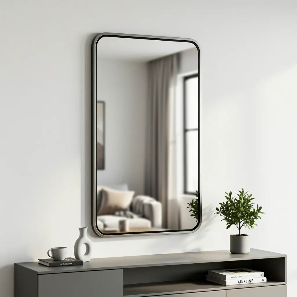
A big mirror in a minimal frame, thin metal edge or no frame at all, does two jobs at once. It bounces light around the room, and it counts as real wall art on its own. That’s a good deal for one purchase.
Round shapes and asymmetrical ones feel more current these days. A large rectangular mirror in a sleek frame still works fine too, if that’s what suits the room better.
6. Use Negative Space Instead of Filling Every Wall
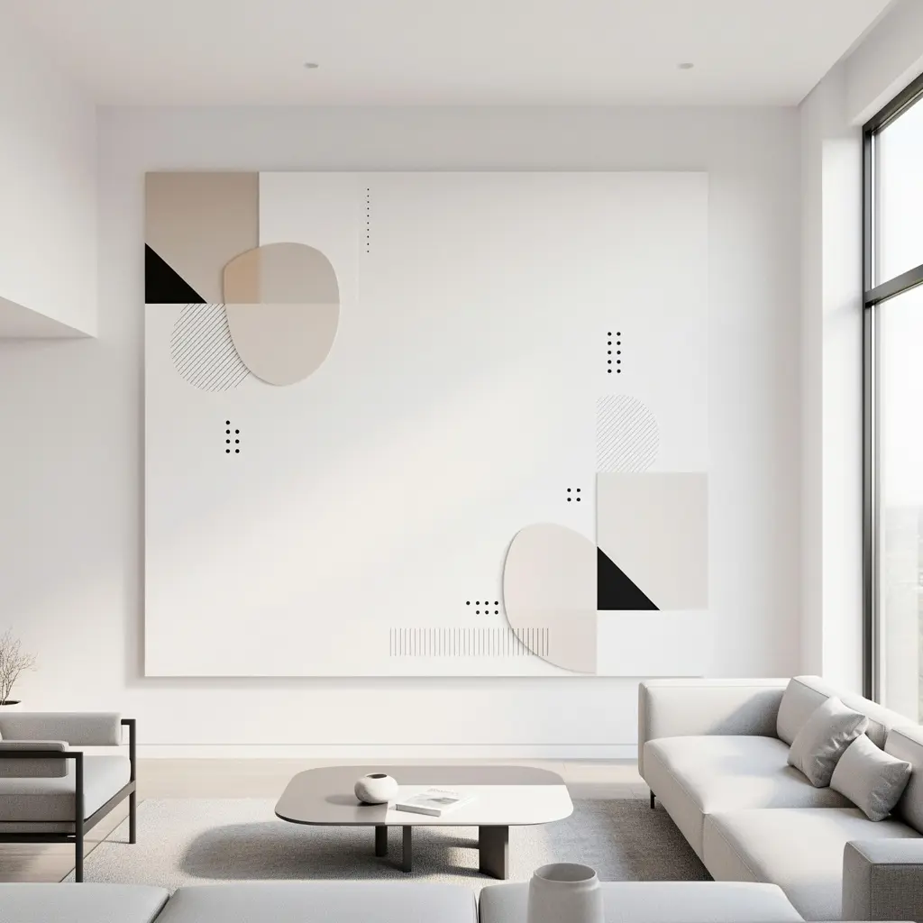
This is the one people struggle with most. Just leave it empty. Some walls, in a properly modern room, should stay mostly bare, or hold exactly one piece, chosen carefully, instead of getting filled edge to edge, no matter how tempting it is to add just one more thing.
It takes some nerve, honestly. Leaving a big wall mostly blank, with one art piece placed deliberately off center rather than dead center, usually reads as more sophisticated than a wall packed with items trying to fill every last inch. But once you see it done right, the empty space starts to look like the point, not a mistake someone forgot to fix.
7. Add Metal Wall Art for an Industrial Edge
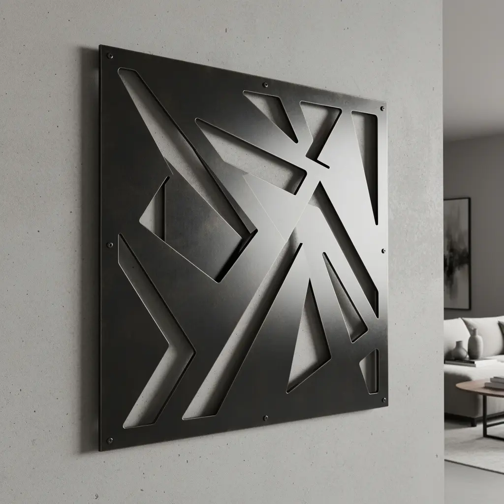
Metal wall art brings texture that pairs naturally with modern interiors. A geometric sculpture. A set of abstract shapes. Even a large, minimal metal clock. Brushed steel, matte black, warm brass, any of it works, depending on what other metal finishes are already in the room.
Stick to one main metal piece per wall. Scattering several smaller ones around undoes the clean, uncluttered look modern style depends on in the first place.
8. Choose Black and White Photography for a Clean Look
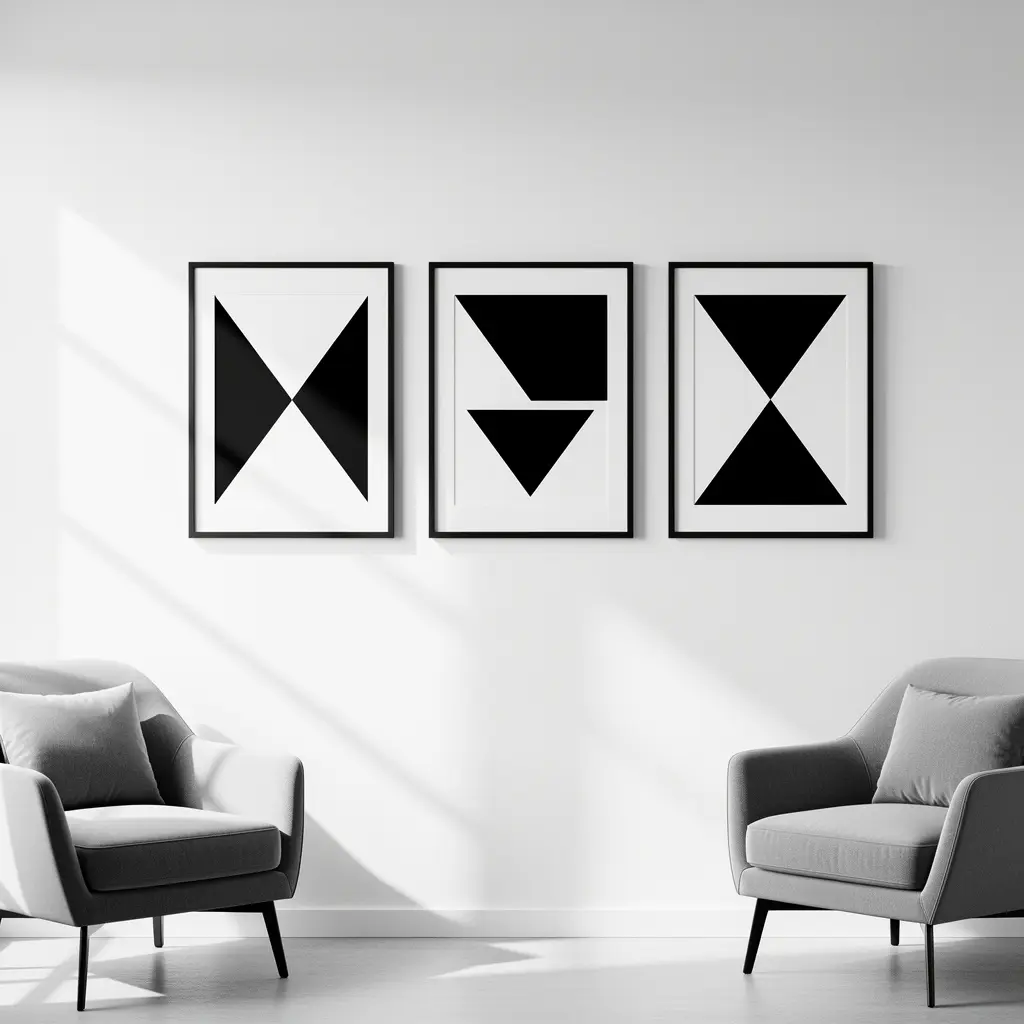
Black and white photography has a timeless quality that fits modern rooms especially well, mostly because it doesn’t introduce extra color that might clash with an otherwise neutral space. Landscape, architecture, portraits, all of it works as a single statement piece or as part of a tight gallery grid, and none of it dates the way trend driven color photography sometimes does.
If you’re using more than one photograph, keep the framing identical across all of them. That consistency is what makes a photo collection feel curated instead of just randomly picked up over time.
9. Use Floating Shelves as a Minimalist Display
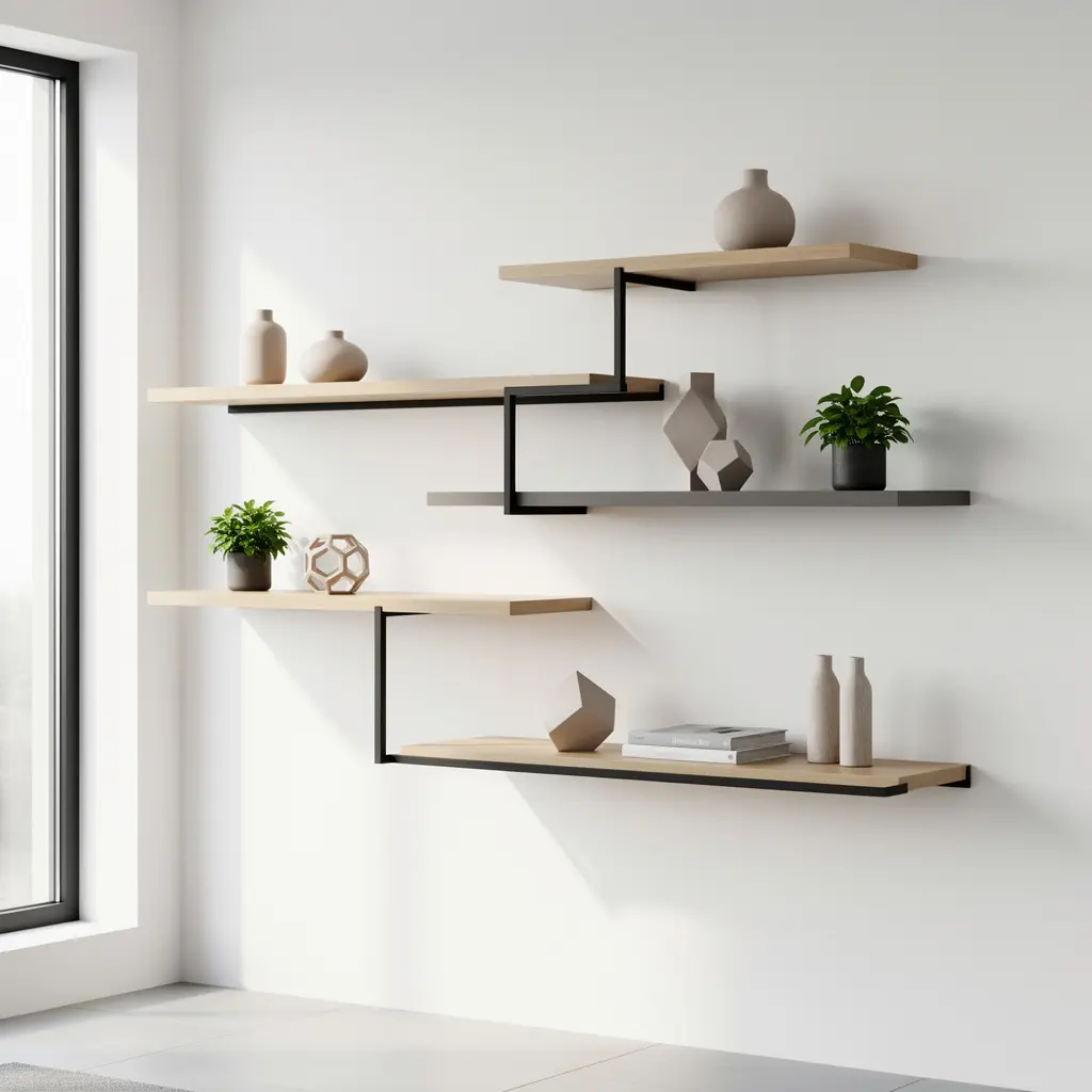
Style a floating shelf with restraint. One sculptural object, a small plant, maybe one book lying flat. That’s it. It looks a lot more modern than a shelf crowded with a dozen small decorative pieces fighting for space.
Keep the shelf design simple too. A clean rectangle in wood or metal, nothing ornate. The shelf itself shouldn’t be competing with what’s sitting on it.
10. Add a Bold Accent Wall With Paint or Wallpaper
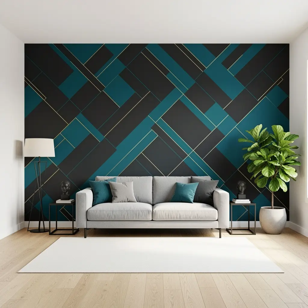
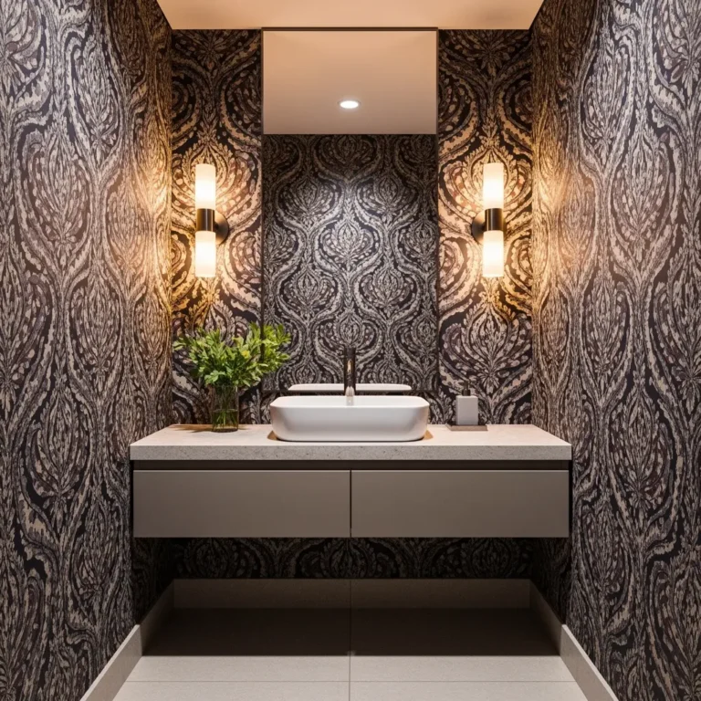
One bold wall, a saturated color or a graphic wallpaper, gives a modern room a focal point without needing much else on the walls around it. Geometric or abstract wallpaper patterns work especially well, since they reinforce the same clean lines that define the rest of the style.
Keep the other walls simple and mostly undecorated. Let the accent wall do the work instead of competing with three other busy walls in the same room.
Mistakes to Avoid
- Filling every wall with multiple small pieces instead of committing to fewer, larger ones
- Mixing too many frame colors and styles in a gallery wall meant to feel modern and cohesive
- Choosing ornate or heavily detailed art that clashes with an otherwise clean, minimal room
- Fearing negative space and feeling the need to decorate every available inch of wall
- Scattering several sculptural or metal pieces around instead of choosing one strong statement item
- Overcrowding floating shelves with too many small decorative objects
Frequently Asked Questions
How big should modern wall art be above a sofa? Roughly two thirds the width of the sofa, which usually lands somewhere between 40 and 72 inches depending on the piece of furniture itself.
Is a grid gallery wall better than an eclectic one for a modern room? Generally, yes. A strict grid with matching frames reads as far more intentional than a loose, mismatched layout, which honestly suits maximalist or eclectic styles better anyway.
Can modern wall decor include color, or does it need to stay neutral? Color’s fine, especially through one bold accent wall or a single statement piece. The trick is keeping it contained to one strong move rather than scattering color across a bunch of small elements.
How much empty wall space is too much in a modern room? No strict rule here, but a wall that feels unfinished instead of intentional almost always just needs one anchor piece, even a small one, placed with some thought.
What’s the easiest way to make a room feel more modern without redecorating everything? Swap several small pieces for one large one. Take a few things down and let the wall breathe a little. Both usually make a bigger difference than adding anything new at all.
Conclusion
Modern wall decor is really about restraint and scale, not a specific art style or a strict color rule. Fewer, bigger pieces over a lot of small ones. A clean grid if you’re doing a gallery wall. And the nerve to leave some space genuinely empty. That mix of intention and negative space is what separates a wall that feels considered from one that just looks bare, and it’s easier to pull off than it sounds once you stop trying to fill every gap in sight.