
You buy one blush pink throw pillow, love it, then add three more pink things over the following weeks, and suddenly the living room looks like it belongs in a candy shop instead of a home you actually want to sit in. That’s the most common trap with blush pink home decor ideas, and it comes down to using the color everywhere at once instead of layering it with intention. Done right, blush pink can feel warm, calm, and a little grounded. Done in bulk, it tips into overwhelming fast.
The fix isn’t avoiding pink. It’s using it as one note in a larger palette, mixed with warm neutrals, real texture, and a few pieces that ground the room instead of floating it into pastel territory. These ten ideas walk through exactly how to do that, room by room, without needing to repaint or replace furniture you already like.
1. Start With One Blush Pink Anchor Piece Instead of Redecorating Everything
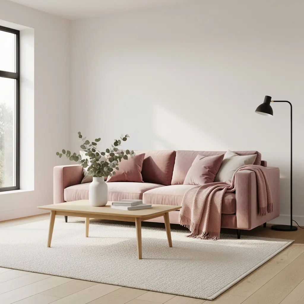
Rather than introducing blush pink through five small accessories scattered around a room, pick one larger piece, like an accent chair, a sofa, or a headboard, and let that carry the color. One anchor piece gives the eye a clear focal point instead of pink popping up in six unrelated spots.
A blush velvet or linen accent chair, generally priced between 300 and 800 dollars depending on the fabric and brand, works especially well in a living room or reading nook because it’s substantial enough to read as intentional, not accidental.
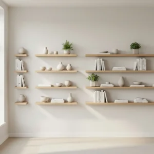
Why Scattering Pink Backfires
When blush shows up in a pillow, a candle, a small tray, and a picture frame all in the same room, none of those pieces get to matter individually. The eye can’t settle. One larger anchor piece solves that by giving the color a clear home base.
2. Layer Blush Pink Throw Pillows and Textiles the Right Way
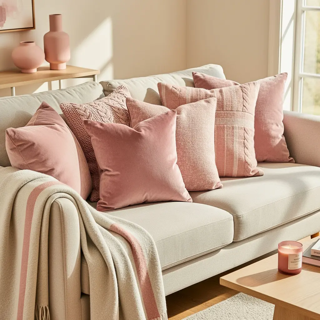
Pillows are the easiest, lowest commitment way to bring in blush pink, but a matching set of four identical pink pillows can flatten a couch fast. Mixing a blush pink pillow with a textured cream or oatmeal pillow, plus one in a deeper tone like rust or forest green, keeps the arrangement from reading as one note.
Vary the fabric too. A velvet blush pillow next to a woven cotton or linen pillow adds texture contrast that a matching set never will. Standard pillow covers run roughly 15 to 40 dollars each, which makes this one of the cheapest ways to test blush pink before committing to bigger furniture.
3. Use Ceramic and Glass Vases to Introduce Pink Without Commitment
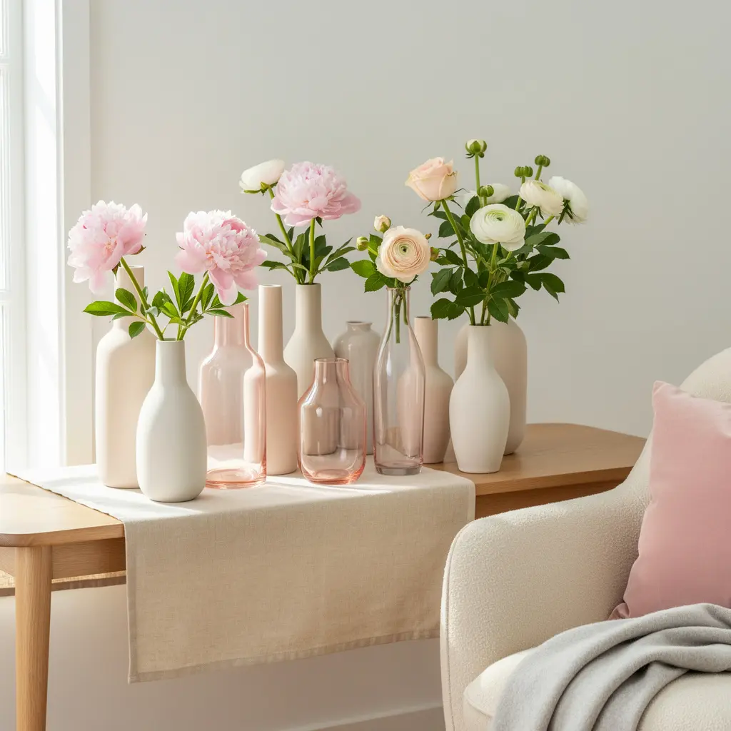
A blush pink ceramic or glass vase, generally priced between 20 and 60 dollars, is a low risk way to bring color into a shelf, mantel, or dining table without touching walls or furniture. If you’re unsure whether you’ll like blush pink long term, this is where to start.
Group vases in odd numbers, typically three, at varying heights, and mix in at least one piece in a different material, like a wood bowl or a woven basket, so the grouping doesn’t look like a matched set from a single store display.
4. Pair Blush Pink With Warm Wood Furniture for Balance
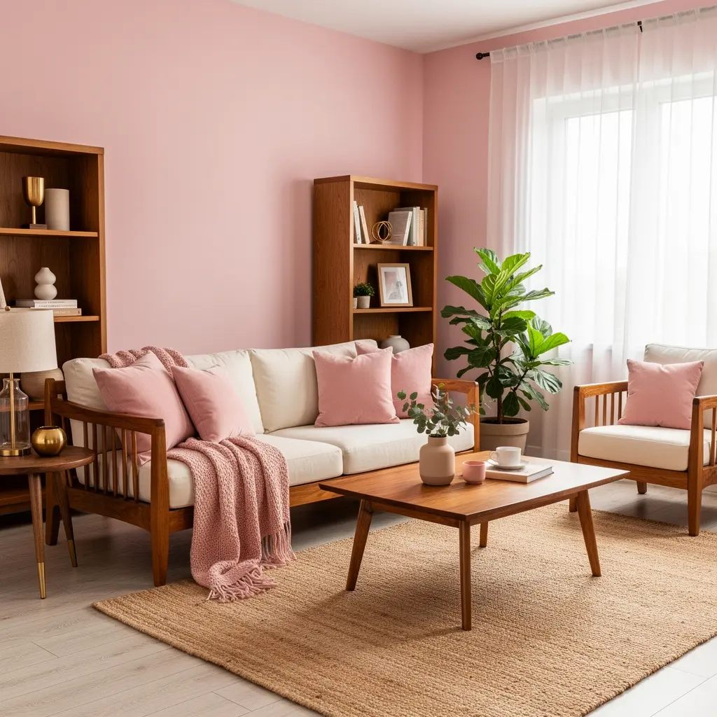
Blush pink next to cool gray furniture can feel a little flat or even slightly cold, since both tones lean neutral in different directions. Warm wood tones, like oak, walnut, or a honey stained pine, give blush pink something to visually lean against, which grounds the color instead of letting it float.
This matters most in larger pieces like coffee tables, dining tables, and bed frames, since those set the tone for the whole room. A single warm wood piece can rebalance a room that’s started to feel too soft or pastel heavy.
5. Add Blush Pink Through Rugs Without Overpowering the Room
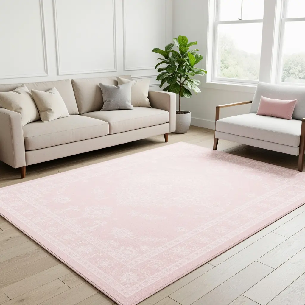
A rug with a subtle blush pink tone woven through a pattern, rather than a solid blush colored rug, tends to age better and pairs more easily with existing furniture. Solid colored rugs in bold pastels can be harder to build a room around later if your taste shifts.
Look for rugs that combine blush with cream, taupe, or a soft gray in a muted pattern. Area rugs in this style generally run anywhere from 100 dollars for a smaller size up to 500 dollars or more for larger, higher pile options.
6. Choose Warm Metal Accents That Work With Pink Tones
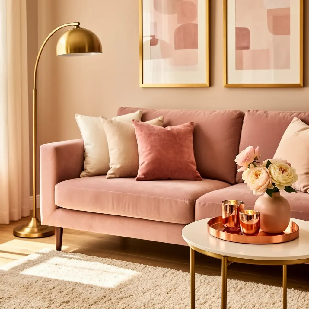
Brushed brass, warm gold, and matte black tend to complement blush pink more naturally than chrome or cool silver finishes, which can make pink look slightly dull by comparison. This applies to everything from picture frames to drawer pulls to lamp bases.
Keeping Metals Consistent Across a Room
Picking one dominant metal finish and repeating it across at least two or three pieces in the same room, rather than mixing four different metals, keeps a blush pink space feeling curated instead of like a collection of unrelated purchases.
7. Bring in Dried Botanicals and Greenery for a Natural Contrast
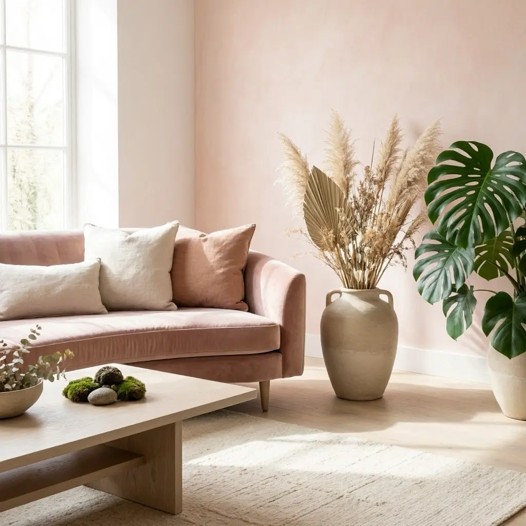
Dried pampas grass, eucalyptus, and bunny tail grass add a soft, organic texture that keeps a blush pink room from feeling too polished or artificial. These arrangements also require zero maintenance, which makes them a practical choice for anyone who tends to forget to water actual plants.
A single dried arrangement in a ceramic or glass vase, priced generally in the 20 to 45 dollar range, can visually balance out several pink accessories in the same space by adding a neutral, textured counterpoint.
8. Use Blush Pink in Small Doses Through Kitchen and Bath Accents
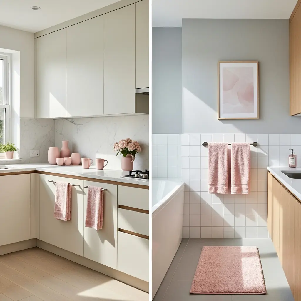
Kitchen and bathroom spaces don’t need a full color overhaul to pick up a blush pink theme. A set of ceramic canisters, a soap dispenser, or hand towels in blush tones, generally priced in the 10 to 35 dollar range per item, add color without any permanent changes.
This approach works particularly well in rentals, where painting or replacing fixtures usually isn’t an option, but swapping out a few textiles and accessories is.
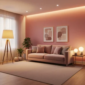
9. Layer Warm Lighting So Blush Pink Doesn’t Look Washed Out
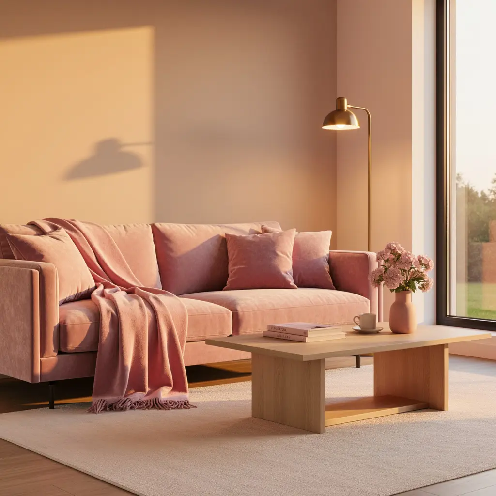
Cool, blue toned LED bulbs can make blush pink look gray or flat, especially in rooms that don’t get much natural light. Bulbs labeled warm white or soft white, generally in the 2700K to 3000K range, keep blush tones looking rich rather than washed out.
Layering a few light sources, like a floor lamp, a table lamp, and one overhead fixture, rather than relying on a single bright overhead light, also helps blush pink read as warm and inviting instead of flat and clinical.
10. Mix Blush Pink With a Bold Neutral for a Grown Up Look
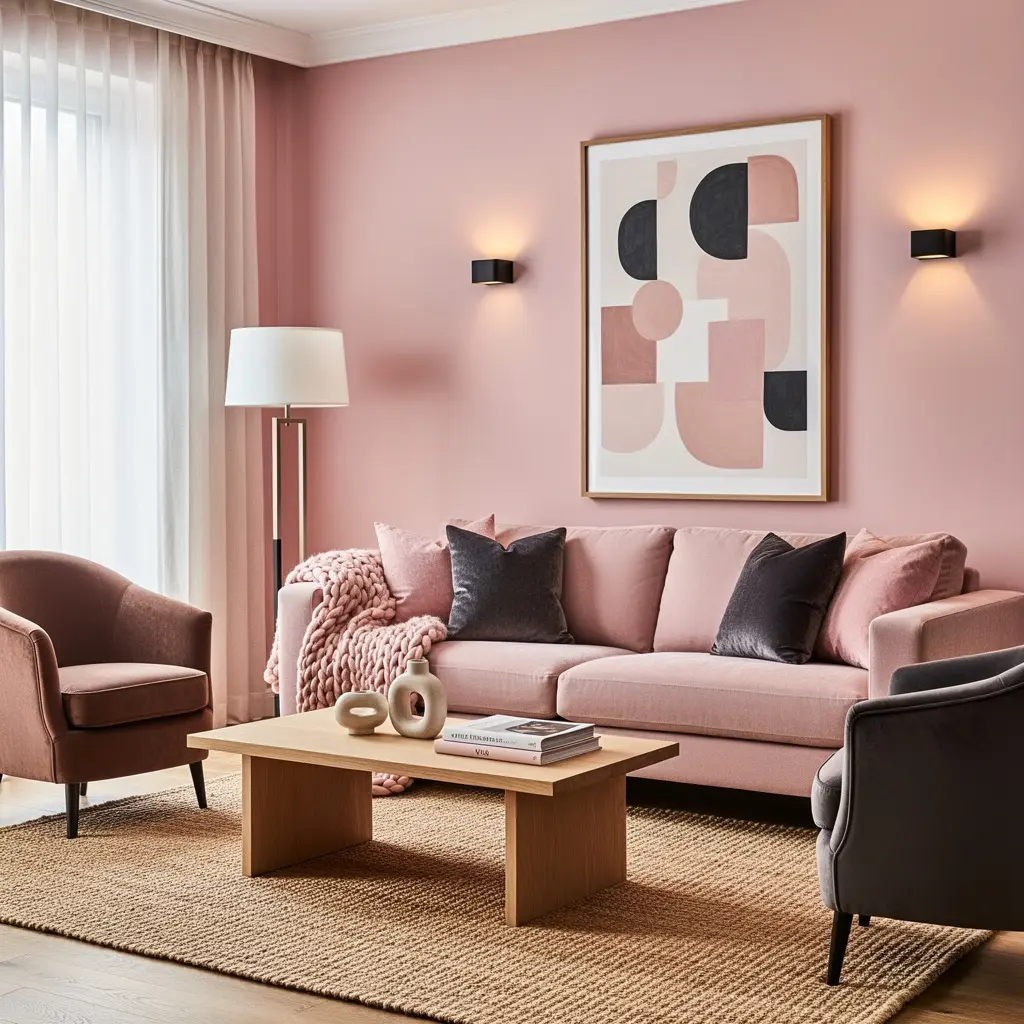
Pairing blush pink with only white and cream can start to feel a little one dimensional after a while. Adding one deeper, bolder neutral, like charcoal, deep navy, or a rich espresso brown, in a single larger piece, such as a sofa or a set of curtains, gives the room contrast and keeps it from reading as entirely pastel.
This contrast is often what separates a blush pink room that feels sophisticated from one that feels like it stopped developing past the first color choice.
Mistakes to Avoid
- Buying multiple small blush pink accessories at once instead of choosing one larger anchor piece
- Matching every pillow, vase, and frame in the exact same shade of pink
- Pairing blush pink only with cool gray or white, with no warm wood or metal to balance it
- Using cool white LED lighting, which flattens the warmth in blush tones
- Choosing a solid blush rug without testing how it looks against existing furniture first
- Skipping contrast entirely and keeping every element in the same soft pastel range
Frequently Asked Questions
Is blush pink home decor going out of style? Muted, warm toned blush has stayed a fairly consistent presence in home decor for several years because it pairs easily with both warm and neutral palettes. Brighter, more saturated pink trends tend to cycle in and out faster than the muted, dusty versions of the color.
How much blush pink is too much in one room? A general rule is to let blush pink cover no more than about a third of the visible color in a room, spread across one or two anchor pieces rather than scattered evenly across every surface. Beyond that, the room can start to feel like a single note rather than a layered space.
What neutral goes best with blush pink? Warm neutrals like cream, oatmeal, and taupe tend to pair more naturally with blush pink than stark white or cool gray, since they share similar warm undertones. A deeper neutral like charcoal or espresso brown adds useful contrast in smaller doses.
Can blush pink work in a masculine or gender neutral space? Yes, especially when it’s a muted, dusty shade paired with black metal accents, deep wood tones, and minimal florals. The femininity associated with blush pink usually comes from how bright the shade is and what it’s paired with, not the color itself.
Where should I start if I want to try blush pink but I’m not sure I’ll like it? Start small, with a vase, a set of pillow covers, or a few textiles rather than furniture or paint. These lower cost pieces let you live with the color for a few weeks before deciding whether to commit to something larger and less easy to change.
Conclusion
Blush pink home decor works best as a supporting color, not the entire story. Pick one anchor piece, layer in warm wood and metal, add texture through pillows and rugs, and keep at least one bolder neutral in the mix so the room doesn’t drift into one flat pastel note. Start with something small and low commitment, live with it for a few weeks, and build outward from there rather than trying to pull the whole look together in a single shopping trip.

Leave a Reply