10 Blush Pink Kitchen Ideas That Feel Elegant, Not Overly Sweet
You love the idea of a blush pink kitchen, but you’re worried committing to the color will make the space feel more like a candy shop than a room you actually want to cook and gather in every day. Blush pink kitchen ideas that genuinely work treat the color with real restraint, choosing the right muted shade, using it in the right proportion against the cabinetry, and pairing it with materials that ground its softness rather than amplifying it. Getting that balance right is what separates a kitchen that feels sugary from one that feels genuinely elevated.
1. Choose a Muted, Dusty Blush for Cabinetry
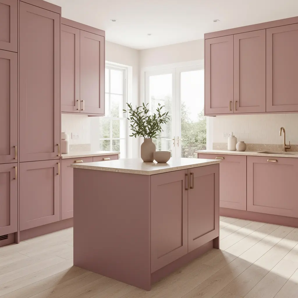
Not every pink behaves the same way once it’s painted across an entire run of cabinets. A blush with a grey or mauve undertone reads as considerably more sophisticated than a bright, clear pastel, even though both technically fall under the same general color name. Starting with this dustier, more muted version on your cabinetry sets an entirely different tone for the whole kitchen than a brighter, more saturated pink would. Names like dusty rose, clay pink, or antique blush on a paint fan deck are usually a reliable starting point when narrowing down cabinet samples.
Why the Undertone Matters So Much on Cabinetry Specifically
Cabinetry covers a huge amount of visual surface in a kitchen, considerably more than a single wall would in a bedroom, so the undertone question matters even more here. A cabinet sample viewed under a small paint chip almost never predicts how the same color will read across an entire run of doors and drawers.
A grey or mauve leaning blush holds its sophistication under a wide range of kitchen lighting, from bright daylight through a window to warm pendant light in the evening, which matters a great deal in a room used at every hour of the day, while a brighter, clearer pastel can start to look a little candy coated under certain conditions, especially under the cool, bright task lighting many kitchens rely on for food prep.
2. Use Blush on Lower Cabinets, Not the Whole Kitchen
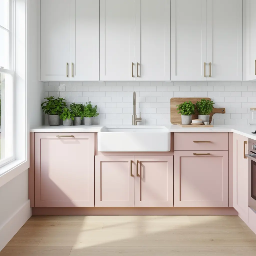
A kitchen with blush cabinetry on every single surface, upper and lower, quickly becomes overwhelming regardless of how nice the shade is on its own, mostly because there’s nothing left in the room to break up the color. Reserving the color for lower cabinets specifically, while keeping upper cabinets in a lighter, more neutral tone, lets blush read as a deliberate, elegant choice rather than the kitchen’s entire identity.
3. Pair Blush With Warm Wood Open Shelving
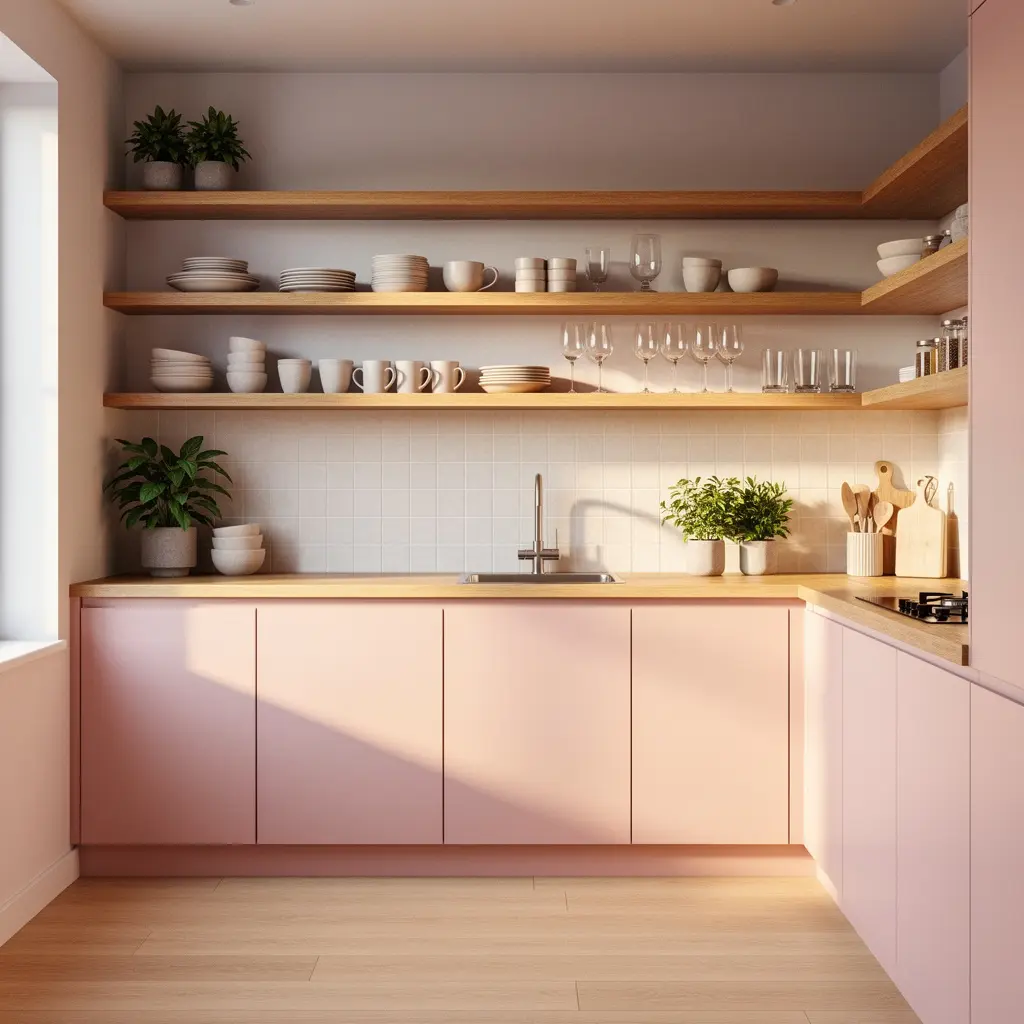
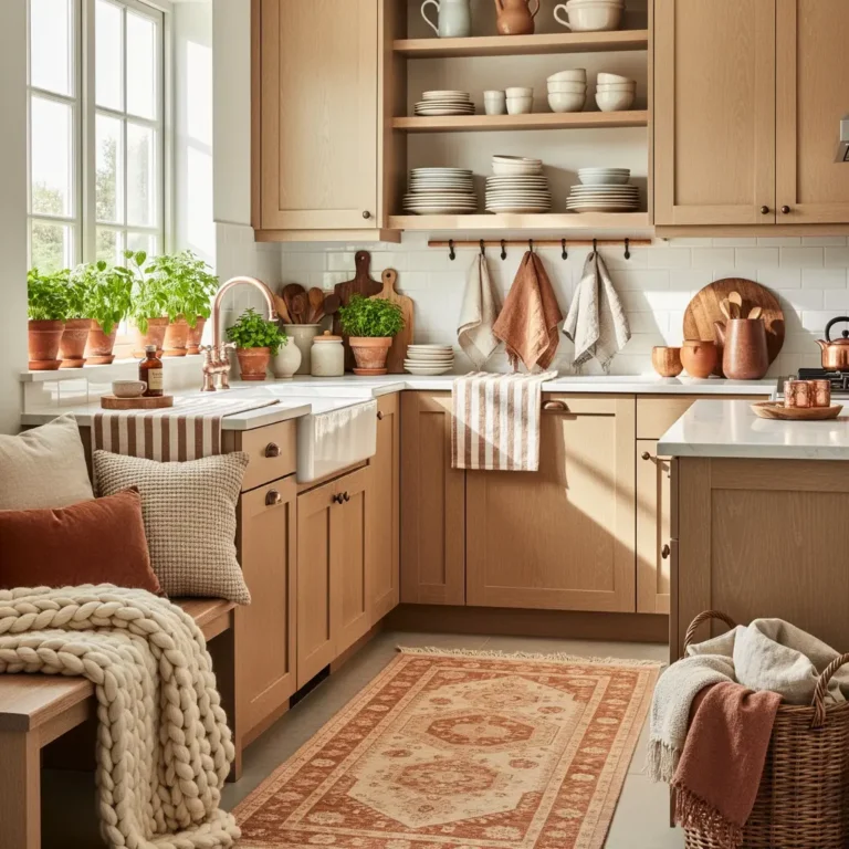
A section of open wood shelving, styled with everyday dishware, breaks up a blush kitchen and adds genuine warmth that closed cabinetry alone can’t achieve. This detail also makes the kitchen feel considerably more like a used, lived in space rather than a color forward display built purely for photos, since the dishes you actually reach for daily stay visible instead of tucked behind a closed door.
4. Add Brass or Warm Gold Hardware
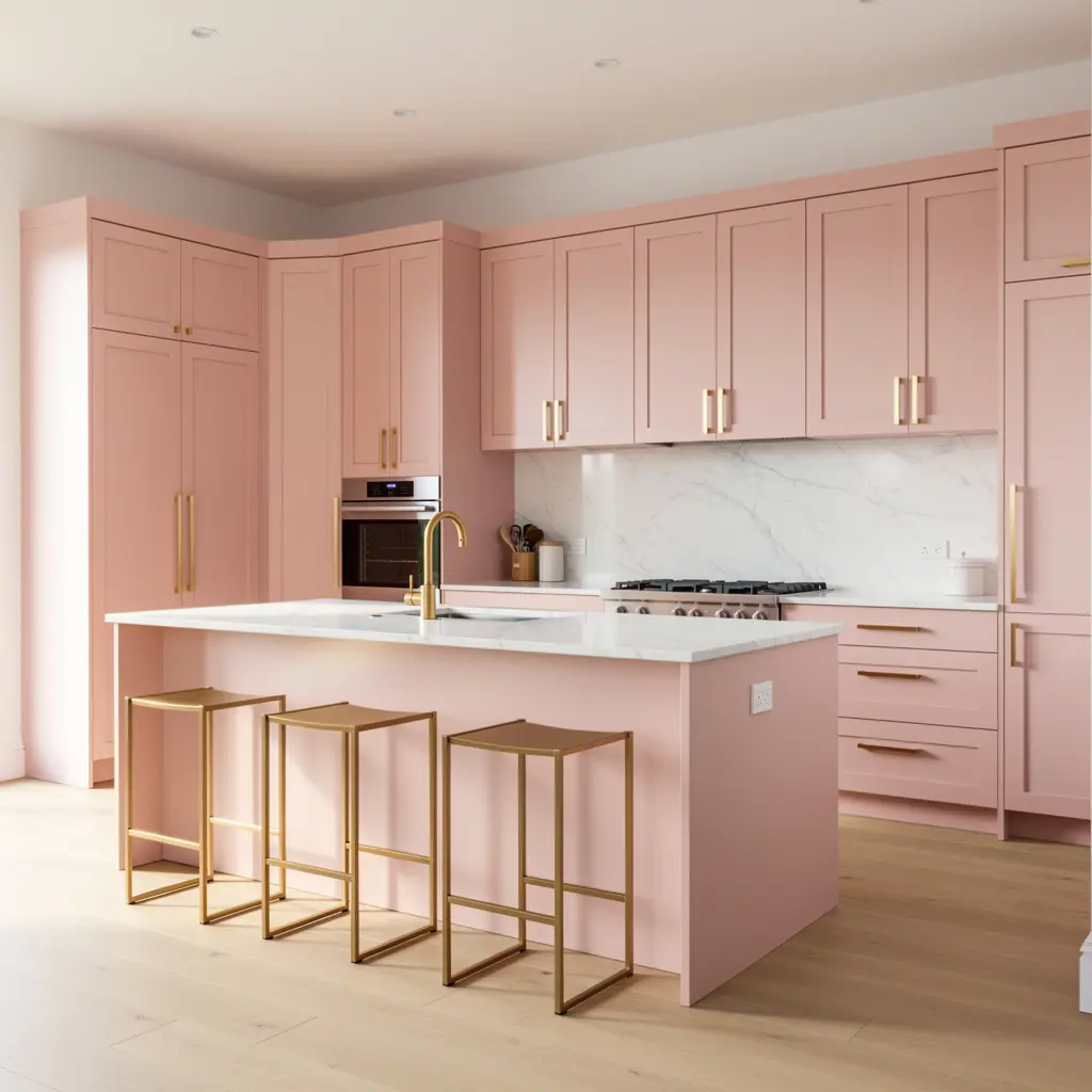
Cool metals like chrome or brushed nickel can push blush toward feeling sweet and a little precious, while brass or gold hardware pulls the whole kitchen toward something more elevated and current. Cabinet pulls, a brass faucet, and pendant lighting in a warm metal finish are small details, but together they shift the entire kitchen’s register considerably. Sticking to one consistent metal finish across all three, rather than mixing brass, gold, and chrome, keeps the accents reading as intentional rather than accidental.
5. Choose a Warm Stone or Marble Countertop
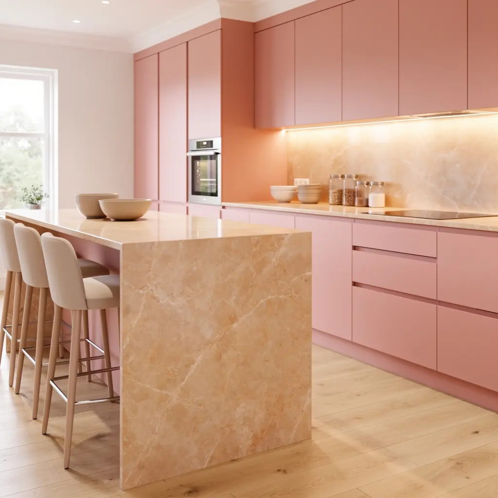
A countertop with warm veining, rather than a stark white or cool grey stone, ties into the blush cabinetry while adding texture and visual interest. This pairing keeps the kitchen from feeling like one flat block of color sitting on top of an unrelated, cold surface. Even a small run of warm veined stone on a single island alone does noticeable work tying the whole kitchen together.
6. Layer in Cream or White Upper Cabinets
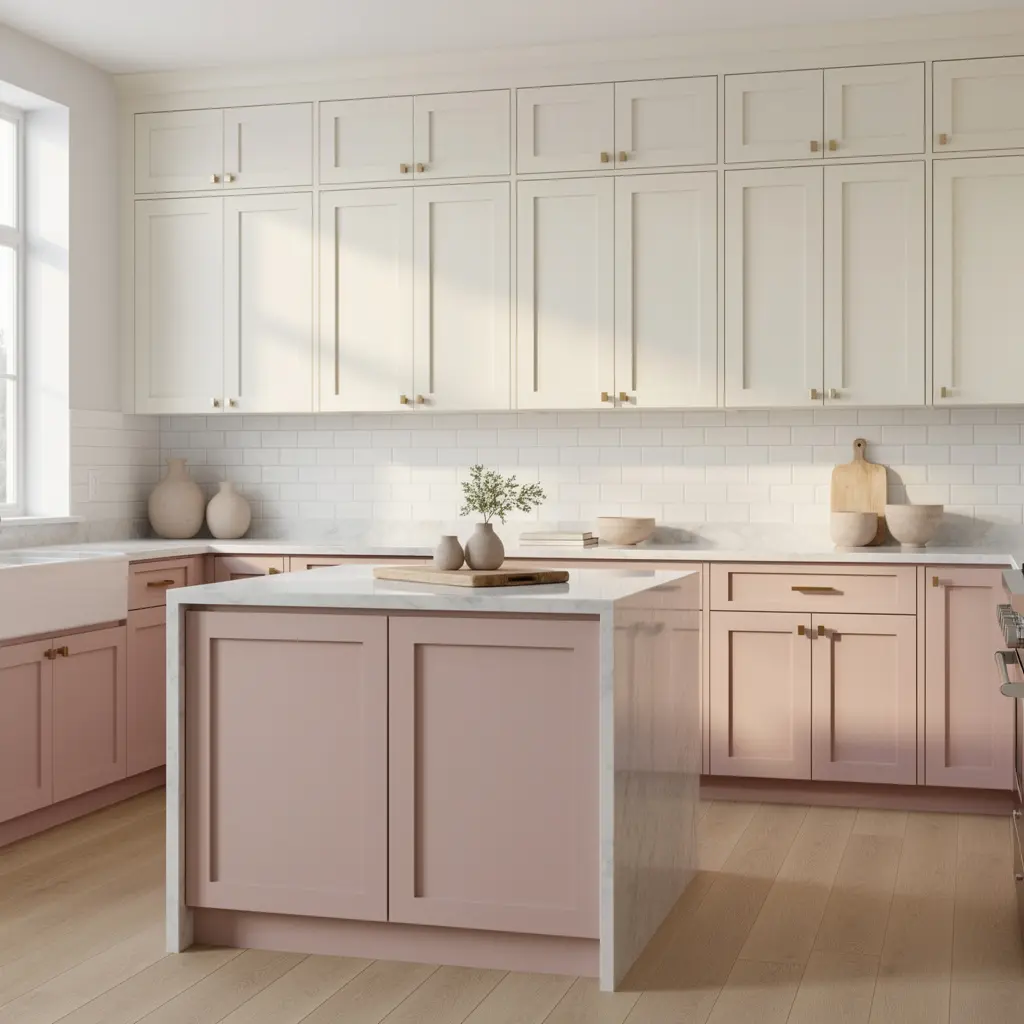
Not every surface in the kitchen needs to carry the pink. Cream or soft white upper cabinets and walls give the eye somewhere to rest, which keeps the whole palette from feeling heavy or overly saturated in a room where you’re actually working and moving around most of the day. Blush lowers paired with cream uppers reads as considerably more restrained than blush covering every cabinet in the kitchen. A common approach keeps roughly two thirds of visible cabinetry in cream or white, with blush reserved for the remaining lower run.
7. Add Texture Through a Patterned Backsplash
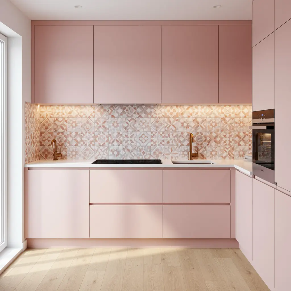
A subtly patterned or textured tile backsplash, in tones that complement rather than compete with the blush cabinetry, adds visual interest without disrupting the overall calm palette. This detail is one of the more effective ways to add personality to a blush kitchen without introducing a second competing color, and it’s a common spot to take a slightly bolder pattern risk since the area is relatively small.
8. Layer Warm, Ambient Lighting Over the Island
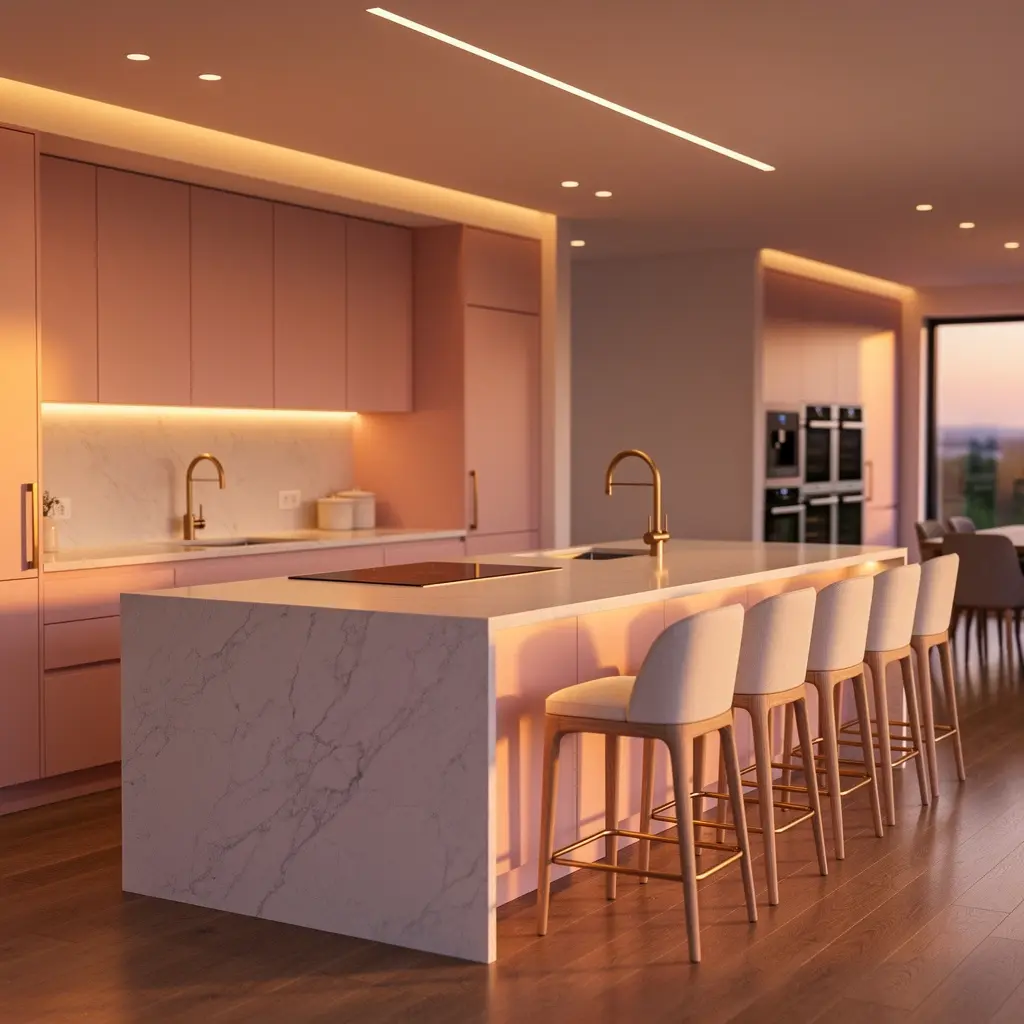
Bright, cool overhead lighting flattens blush cabinetry and can push the color further toward feeling artificial or overly sweet. A pendant light with a warm bulb over the island, paired with warm under cabinet lighting, keeps the whole kitchen feeling elevated rather than candy coated, especially in the evening. Warm white bulbs in the 2700K to 3000K range work best for this kind of ambient kitchen glow.
9. Bring in Greenery for a Living Element
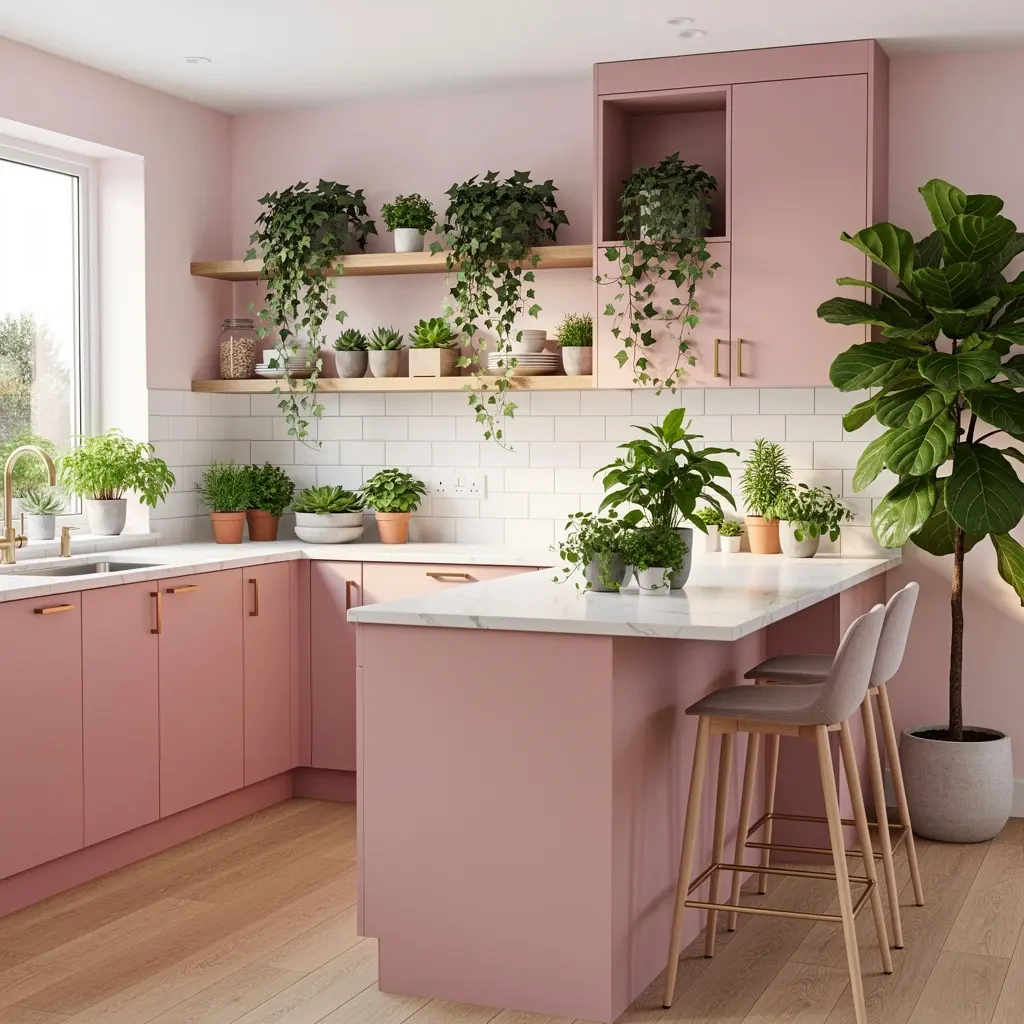
A small potted herb garden on the windowsill or a larger plant in the corner brings a genuine living element into a kitchen that might otherwise feel entirely about color and hard surfaces. Even one or two well placed plants add real warmth against the blush cabinetry, and a small pot of basil or rosemary on the sill does real function alongside the decorative benefit.
10. Keep Countertops Styled but Not Cluttered
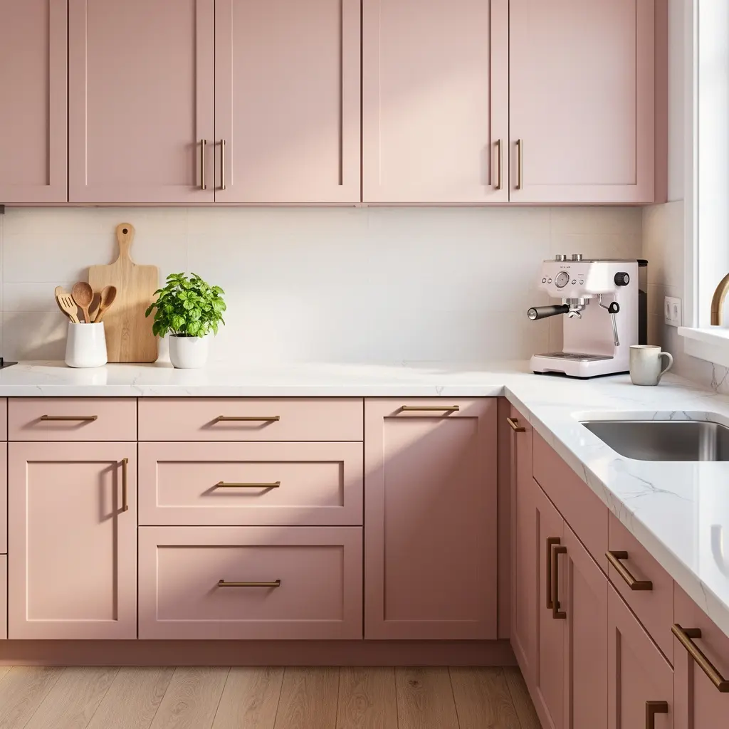
A few intentional objects, a wood cutting board, a small plant, a ceramic canister, add warmth to the counters without tipping into visual clutter. This balance matters especially in a blush kitchen, where too much competing color and pattern can undercut the calm, elevated feeling the palette is meant to create in the first place. Leaving some genuinely clear counter space near the main prep area also keeps the kitchen functional, not just photogenic.
Mistakes to Avoid
- Choosing a bright, clear pastel pink instead of a more muted, dusty blush with a grey or mauve undertone
- Painting every single cabinet, upper and lower, in blush instead of reserving it for the lower run
- Choosing cool chrome or nickel hardware instead of warmer brass or gold accents throughout the kitchen
- Pairing blush with a stark white or cool grey countertop instead of one with warm veining
- Relying on bright, cool overhead lighting instead of warm, layered fixtures over the island
- Overcrowding the counters with clutter instead of a few intentional, styled objects
Frequently Asked Questions
Is blush pink a practical color for kitchen cabinetry? Yes, especially in a muted, dusty shade, which holds up well over time and doesn’t read as trend driven the way a brighter, more saturated pink might a few years down the line. Practically speaking, a quality painted or lacquered finish also holds up fine to daily kitchen wear, just like any other cabinet color.
Should blush pink cover both upper and lower cabinets? Generally not. Reserving the color for lower cabinets while keeping uppers in a lighter neutral tone lets blush read as a deliberate accent rather than overwhelming the whole kitchen. This split also happens to be easier and less expensive to repaint down the road if your taste shifts, since only the lower run needs updating.
What countertop works best with blush pink cabinetry? A warm veined stone or marble ties into the cabinetry’s softness while adding texture, considerably better than a stark white or cool grey surface would. A honed rather than polished finish also tends to suit the whole soft, muted palette better than a high gloss surface.
What hardware finish suits a blush kitchen best? Warm metallics like brass or gold complement blush far better than cool chrome or brushed nickel, which can push the space toward feeling overly sweet or precious.
How do I keep a blush kitchen from feeling dated in a few years? Choosing a muted, dusty shade rather than a bright trend driven pastel, and pairing it with timeless materials like warm wood and stone, helps the palette age considerably better over time. Sticking to classic cabinet door styles, like a simple Shaker profile, over anything trend specific also extends how long the kitchen feels current.
Conclusion
Blush pink kitchen ideas work best when the color gets used with real intention rather than saturation: a muted undertone, reserved for lower cabinetry, paired with warm wood shelving, brass hardware, and a stone countertop with warm veining. Start with your cabinet tone and hardware finish, then layer in texture and lighting so the kitchen reads as elegant and current rather than overly sweet. Once that foundation is in place, the rest of the room tends to fall into place with far less trial and error.