
You want a bedroom that feels calm and restful, but every pale blue room you’ve seen so far looks a little too cold, almost clinical, like a waiting room instead of somewhere you’d want to unwind. That’s the real challenge with a blue pastel bedroom setup. Blue is naturally calming, but without enough warmth mixed in, it can tip into feeling flat or sterile fast. This guide walks through how to build a pastel blue bedroom that reads as cozy and considered, the kind of room that actually helps you sleep better, using real materials, real price ranges, and the reasoning behind each choice.
1. Choosing Your Pastel Blue: Cool, Warm, or Gray Undertones
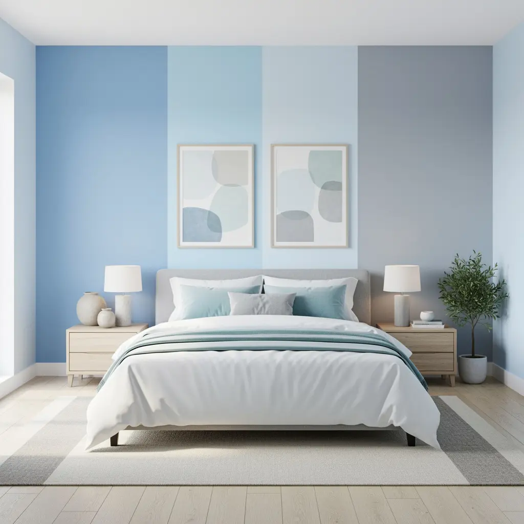
Pastel blue covers a wide range of actual colors. Some lean closer to a true sky blue. Others lean gray, almost like a soft storm color. And some lean slightly green, closer to a seafoam or duck egg tone. The undertone you land on has a big effect on whether the room feels serene or feels sterile, so it’s worth slowing down on this choice before anything else.
Reading Your Room’s Light First
A room with strong, direct sunlight can handle a slightly cooler or grayer blue without feeling cold, since the natural light adds warmth on its own. A room with limited or mostly indirect light tends to need a blue with a touch more warmth in it, otherwise it can look flat or gray for most of the day. Paint a sample swatch at least two feet wide and observe it at different times before committing to a full wall.
2. Balancing Blue With Enough Warmth to Keep It From Feeling Cold
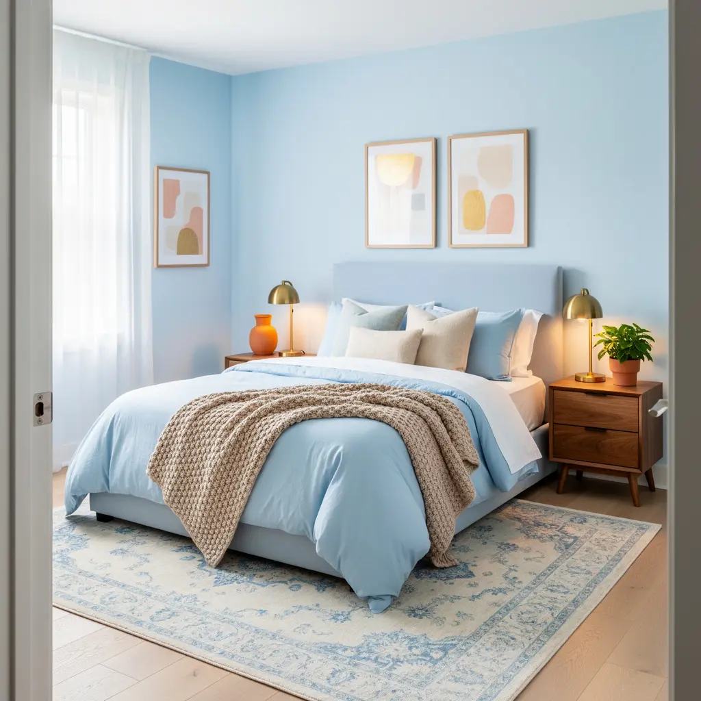
The single biggest risk in a blue pastel bedroom setup is letting the room become entirely cool toned, with blue walls, blue bedding, and cool gray furniture all working against each other instead of together. Warm materials, like natural wood, cream textiles, and brass or gold hardware, act as the counterbalance that keeps the room from feeling like it belongs in a hospital.
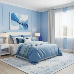
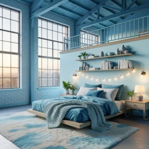
A good general approach is one dominant blue surface, usually the wall or the bedding, paired with warm neutral furniture, a natural fiber rug, and warm toned lighting. That mix of cool and warm is what makes the room feel soothing instead of sterile.
3. Furniture Shapes That Suit a Blue Pastel Bedroom Setup
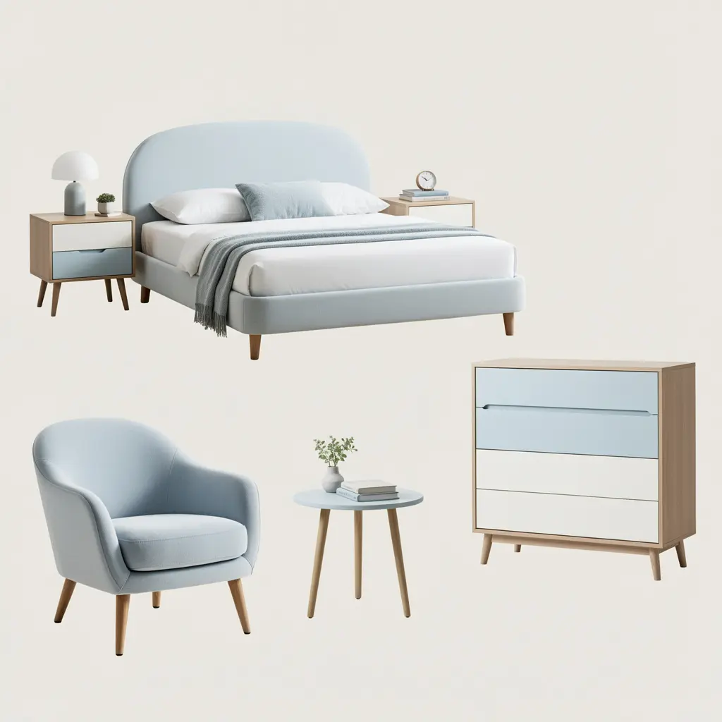
Warm wood tones do a lot of heavy lifting in a pastel blue room. A light oak or walnut bed frame, a rattan headboard, or a wood nightstand all introduce the warmth that pure blue and white can’t provide on their own. Rounded shapes, like an arched mirror or a curved accent chair, soften the overall look and pair naturally with the gentleness of a pastel palette.
That said, keep at least one or two pieces with cleaner, straighter lines so the room doesn’t feel like every item came from the same soft, rounded collection. A boucle or linen accent chair typically runs one hundred fifty to four hundred dollars depending on size and fabric, and it’s often the piece that makes a blue pastel bedroom setup feel current rather than dated.
4. Bedding Layers That Add Depth Without Adding More Color
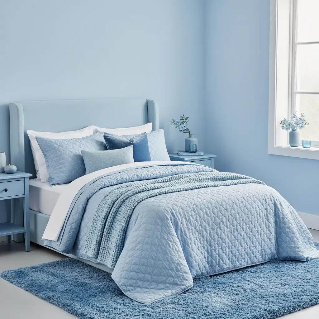
Instead of a heavily patterned blue print, keep the bedding mostly solid and let texture carry the visual interest. A crisp white base sheet, a powder blue quilted coverlet, and a cream or oatmeal waffle weave throw folded at the foot all sit comfortably in the same soft palette without fighting for attention.
This layered approach also makes it easy to shift the room’s mood later. Swapping one throw pillow or blanket for a slightly different shade of blue or a warm neutral changes the whole feel of the bed without requiring an entirely new bedding set.
5. Lighting That Keeps Pastel Blue From Turning Gray at Night
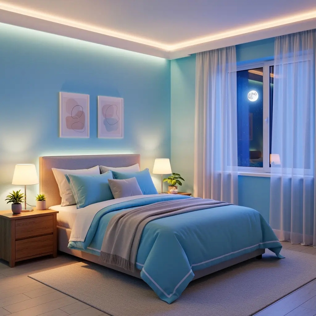
Cool toned bulbs are especially unforgiving on blue walls, since blue and cool white light amplify each other and can make the room feel washed out and flat, particularly after dark. Stick with warm white bulbs in the 2700K to 3000K range for lamps and overhead fixtures. That warmth keeps a pastel blue wall looking soft and dimensional rather than gray and lifeless once the sun goes down.
Layering More Than One Light Source
A single ceiling fixture rarely does a pastel blue room justice, especially in the evening. Add a table lamp on the nightstand and, if there’s space, a floor lamp in a reading corner. Layered lighting lets the room shift from bright and clear during the day to warm and cozy at night, which matters a lot in a color palette that can otherwise skew cold.
6. Wall Treatment Options Beyond a Full Blue Accent Wall
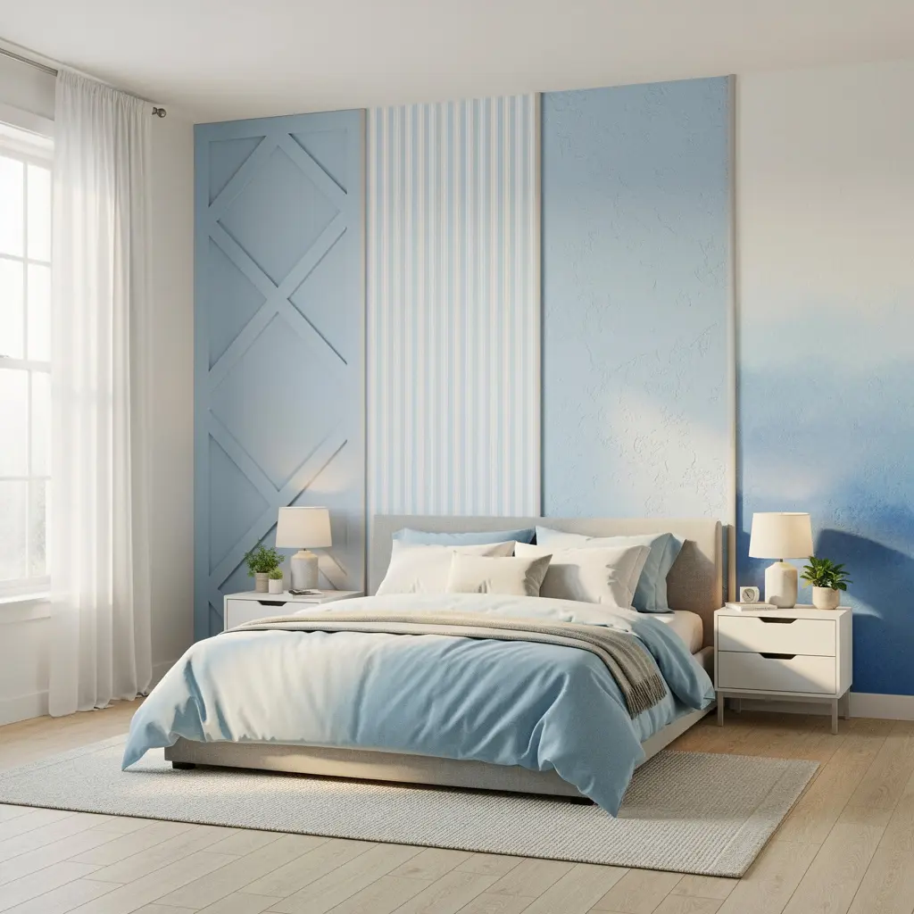
A full room painted pastel blue can feel like a lot, especially in a smaller bedroom or one with limited natural light. Painting just the wall behind the headboard contains the color to one strong, intentional moment while the surrounding walls stay white or a soft off white. It also makes it far easier to update the accent color later without repainting the whole room.
Textured wallpaper in a soft blue or blue and cream pattern, like a subtle stripe or grasscloth, is another option for anyone who wants more visual interest than a flat paint color offers. Peel and stick versions typically run thirty to sixty dollars per roll and are a lower risk way to test the look before a full repaint.
7. Adding Texture So the Room Doesn’t Read as Flat
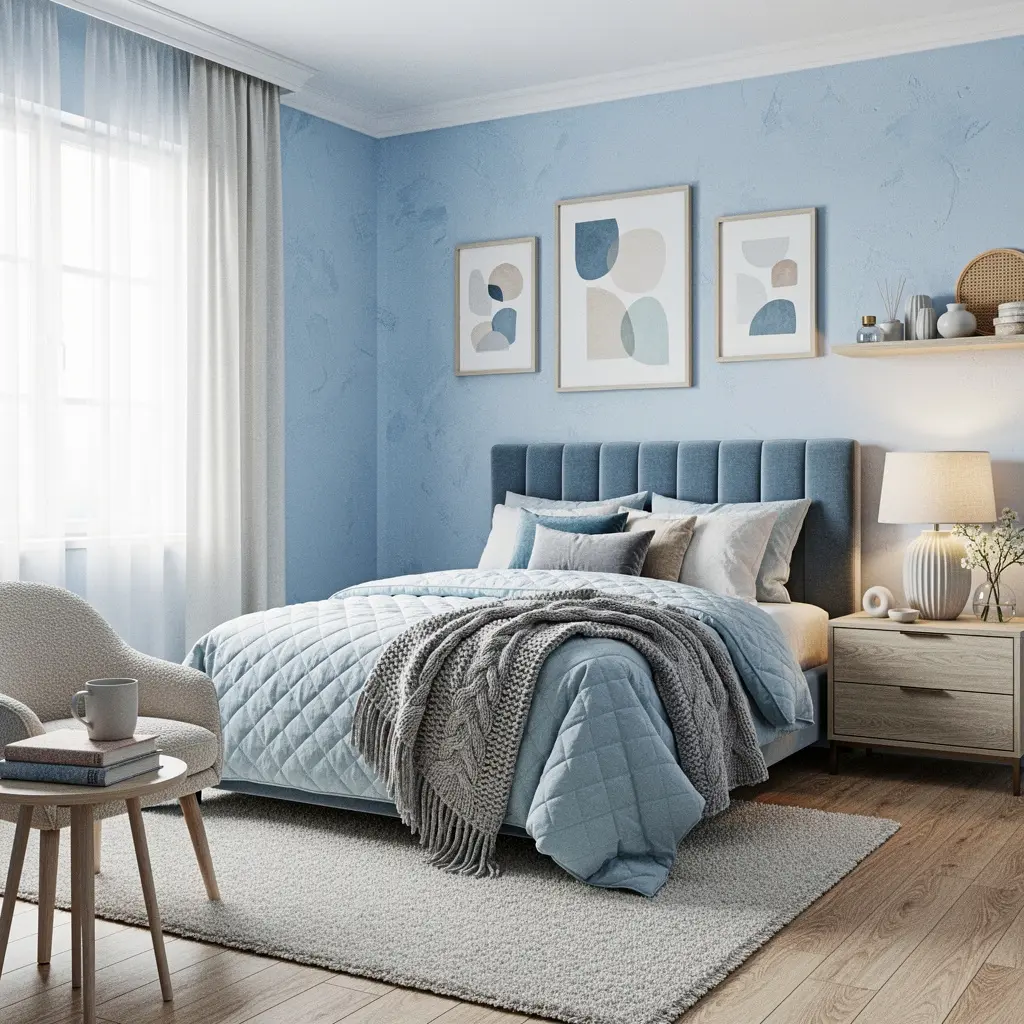
Pastel blue in particular can look flat and one dimensional without enough texture to break it up. A chunky knit throw, a woven jute or wool rug, linen curtains, and a boucle or velvet accent chair all add visual depth without introducing another color into the room. Texture is often the exact thing that separates a pastel blue room that feels styled from one that feels unfinished.
Mixing textures matters just as much as mixing furniture pieces. A room full of smooth, flat surfaces feels colder than a room with a mix of woven, knit, matte, and soft textiles, even with the exact same color palette underneath.
8. Where a Second Pastel Can Work (and Where It Competes)
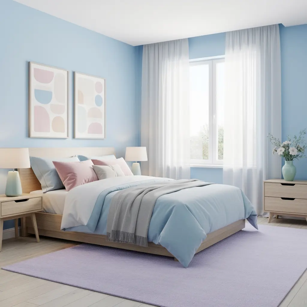
A single accent pastel, like a soft blush pink or pale sage green, can work alongside blue if it’s used sparingly, usually in a throw pillow or a small ceramic accessory. The goal is keeping that second pastel muted enough that it supports the blue rather than pulling attention away from it.
Avoid stacking more than two pastel colors in the same small room. Blue, pink, and lavender all in equal amounts tends to read as a nursery palette rather than a considered adult bedroom. Let blue lead the room and keep any second color in a clearly secondary role.
9. Storage and Organization That Match a Soft, Curated Look
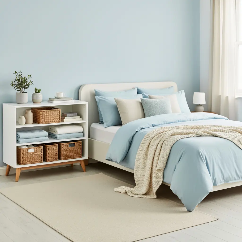
A blue pastel bedroom setup depends on a sense of calm, and that calm disappears quickly if surfaces stay cluttered. Closed storage, like a fabric lined basket or a dresser with solid drawers, keeps everyday items out of sight while staying visually consistent with the room’s softness. A woven basket at the foot of the bed for extra blankets works both practically and aesthetically here.
If open shelving is part of the setup, keep it intentionally minimal. A single ceramic object, a small stack of books, and one plant usually reads as curated. Beyond that, the shelf starts competing with the calm the rest of the room is working to create.
10. Small Room Tricks for a Blue Pastel Bedroom Setup That Feels Open
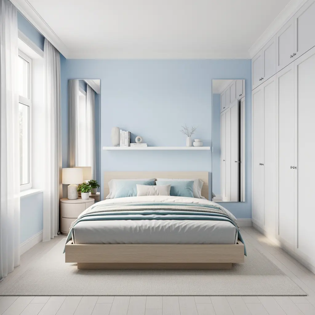
Pastel colors reflect light well, which makes pastel blue a strong choice for a small bedroom that needs to feel more open than its actual square footage. Keep furniture to the essentials, a bed, one nightstand, and a slim dresser, so the room avoids feeling cramped. Every additional piece of furniture works against the open, airy quality pastel tones are naturally good at creating.
A large mirror, either leaning against a wall or mounted across from the window, bounces natural light around the space and helps reinforce that sense of openness. Even a simple floor mirror in the forty to hundred dollar range makes a noticeable difference in how spacious a small blue pastel bedroom setup feels.
Mistakes to Avoid
- Using pastel blue on every surface at once instead of balancing it with warm neutral tones
- Skipping a swatch test and choosing a blue that reads gray or flat under the room’s actual lighting
- Combining more than two pastel colors in the same small space
- Relying on cool toned light bulbs, which can make blue walls look washed out or sterile
- Choosing an all cool toned furniture set with no warm wood or brass accents
- Leaving open shelves overloaded with small decorative objects
- Skipping texture and relying on paint color alone to carry the whole room
Frequently Asked Questions
Does pastel blue work in a bedroom with little natural light? It can, but the undertone matters more in that situation. A pastel blue with a slightly warmer or grayer base tends to hold up better in low light rooms than a very cool, almost icy blue, which can look flat without much sun.
How do I keep a blue pastel bedroom setup from feeling too cold? Balance the blue with warm wood furniture, cream or oatmeal textiles, warm white lighting, and at least one metallic finish like brass or gold. Those warm elements are what keep the room from tipping into a sterile feeling.
What’s the difference between a blue pastel bedroom and a coastal themed bedroom? A blue pastel bedroom setup focuses on the soft color palette and general calming tone, while coastal styling typically adds specific nautical or beach related elements like rope details, striped patterns, or driftwood accents on top of that palette.
Does pastel blue work well with dark furniture? It can, though it creates a more dramatic contrast than an all soft, neutral approach. A single dark wood nightstand or bed frame against pastel blue walls can look intentional, but a full matching set of dark furniture tends to overpower the softness of the palette.
What flooring pairs best with a blue pastel bedroom setup? Light or medium wood tones tend to work best, since they add warmth without competing with the blue. Very dark flooring can create a strong contrast that pulls focus away from the calm, pastel color story.
Conclusion
A blue pastel bedroom setup works best when the blue is balanced by just as much warmth, through wood furniture, warm lighting, and soft natural textures. Choose an undertone that suits your room’s actual light, keep the palette to one dominant blue plus warm neutrals, and let texture do the work of making the space feel finished rather than flat. Handled that way, the room reads as calm and restful, not cold, which is really the whole point of reaching for blue in the first place.

Leave a Reply